Signs and Symbols
To start this Unit, I began with taking key words from the phase given to research
and pull imagery from. The words I chose to do this with were -
Wrestler, Walk, Smell, Roses and Doctors.
and pull imagery from. The words I chose to do this with were -
Wrestler, Walk, Smell, Roses and Doctors.
Wrestler research:
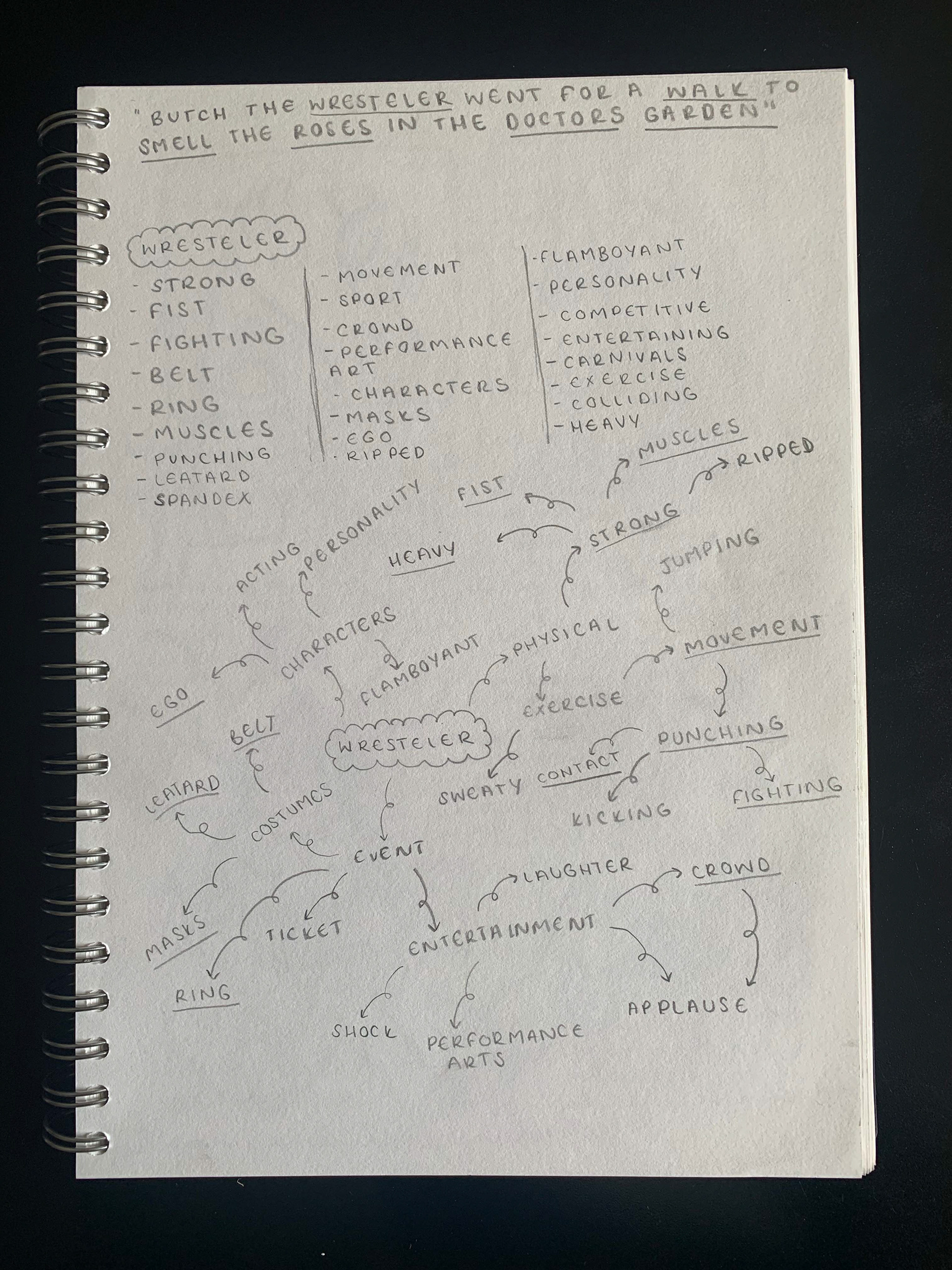
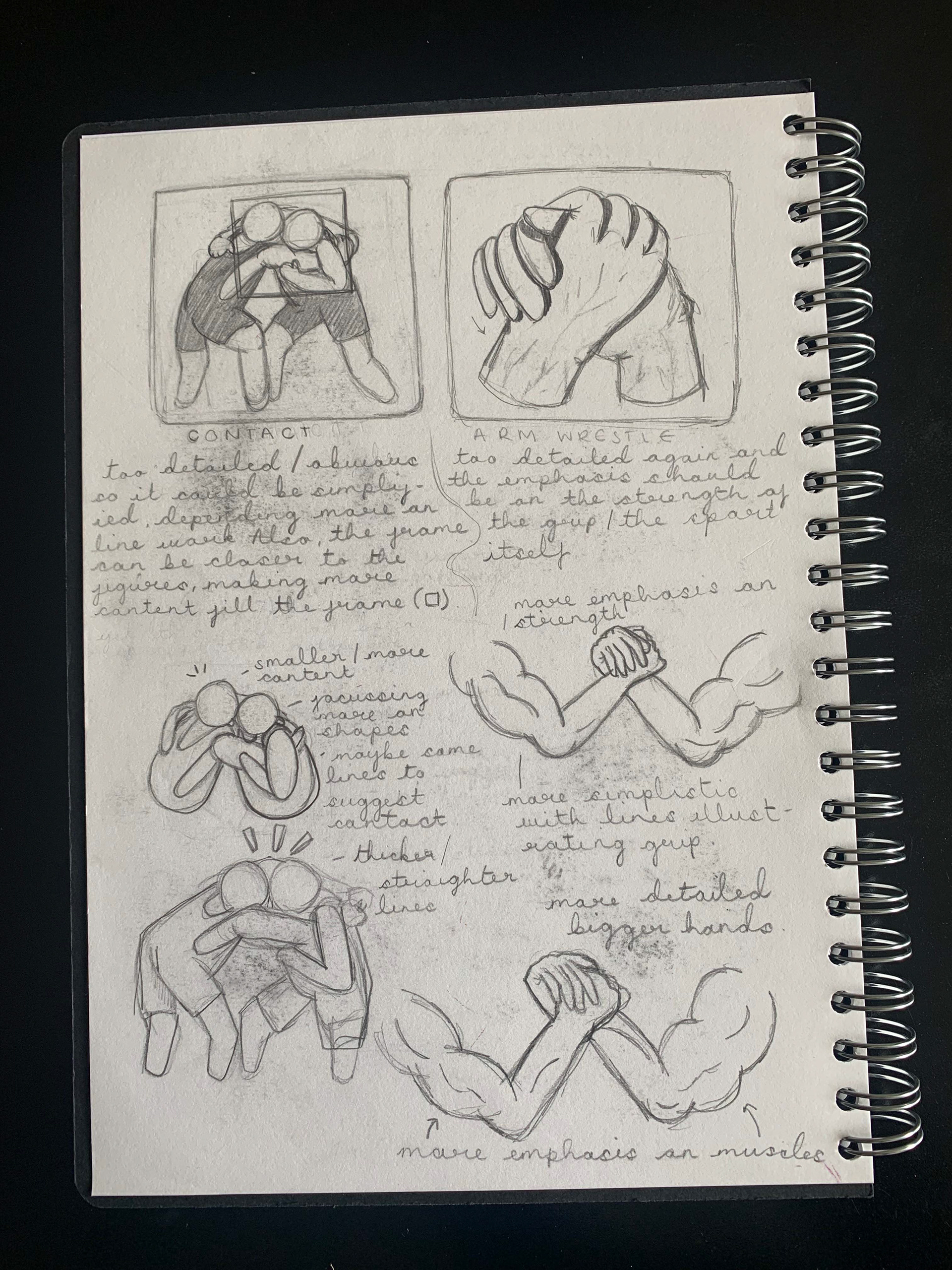


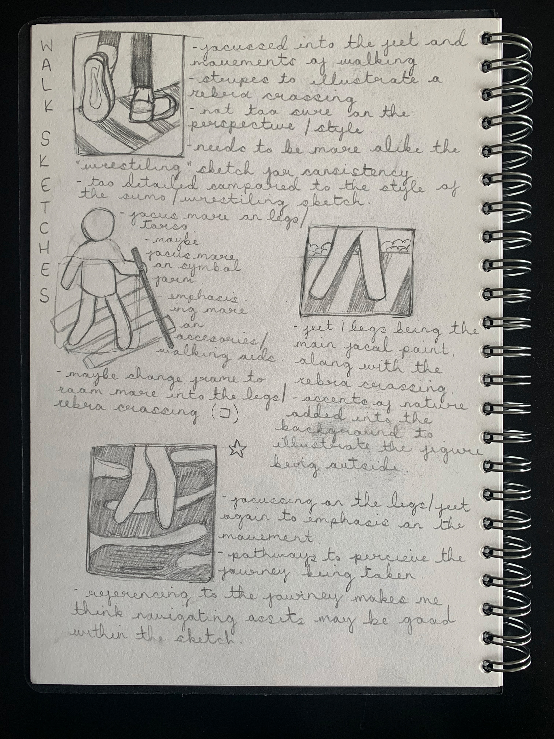
Walk research:

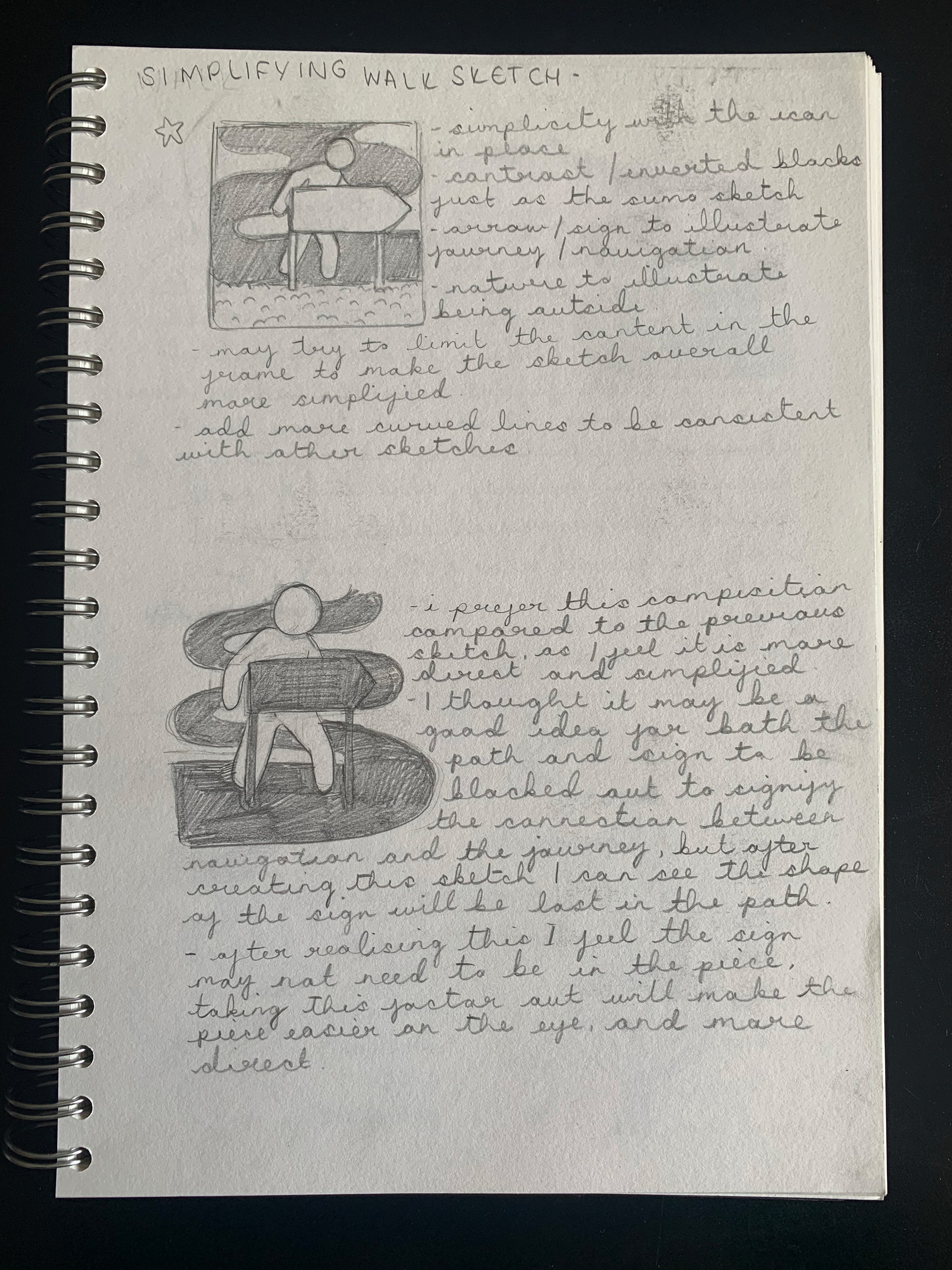
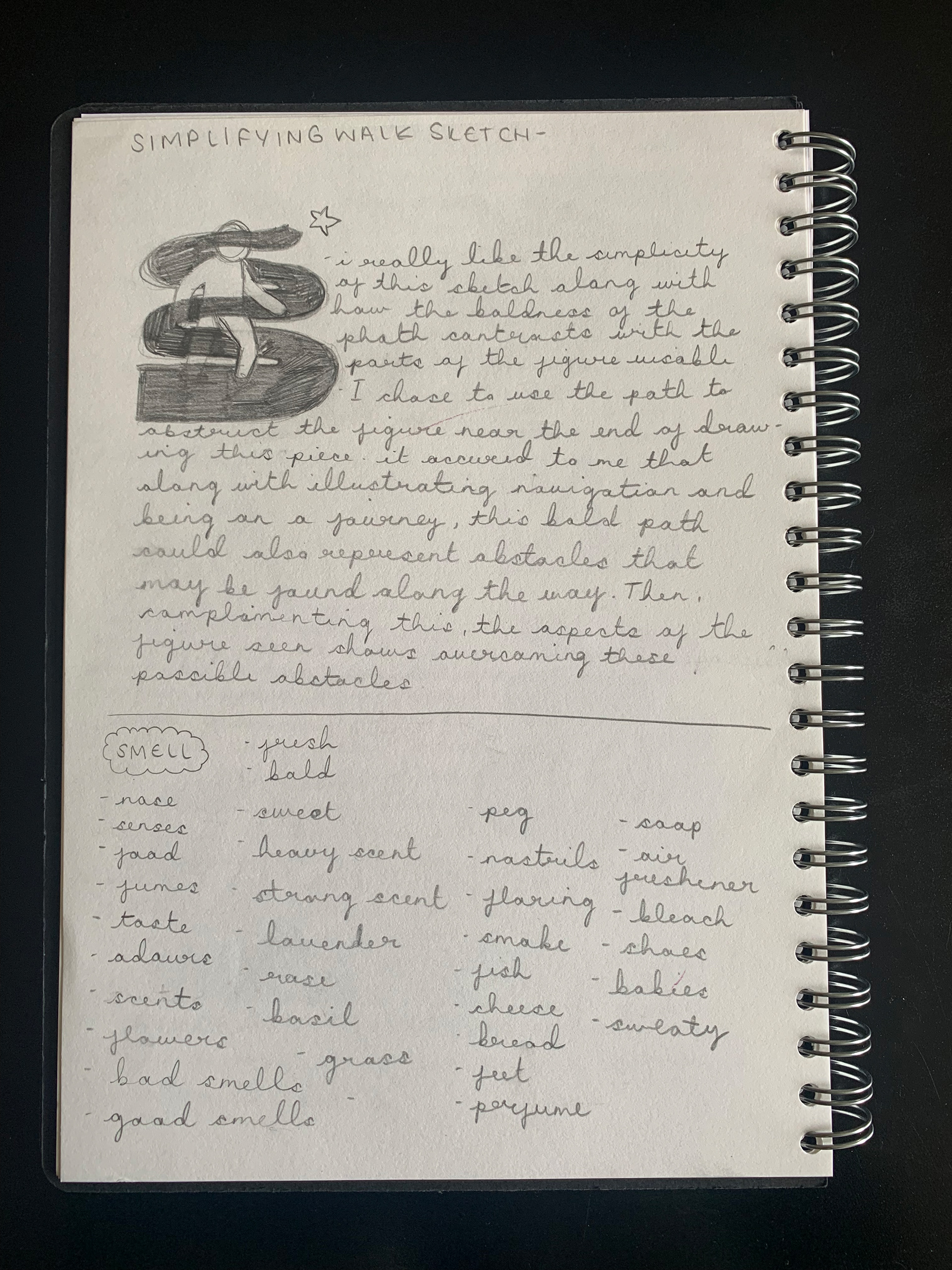
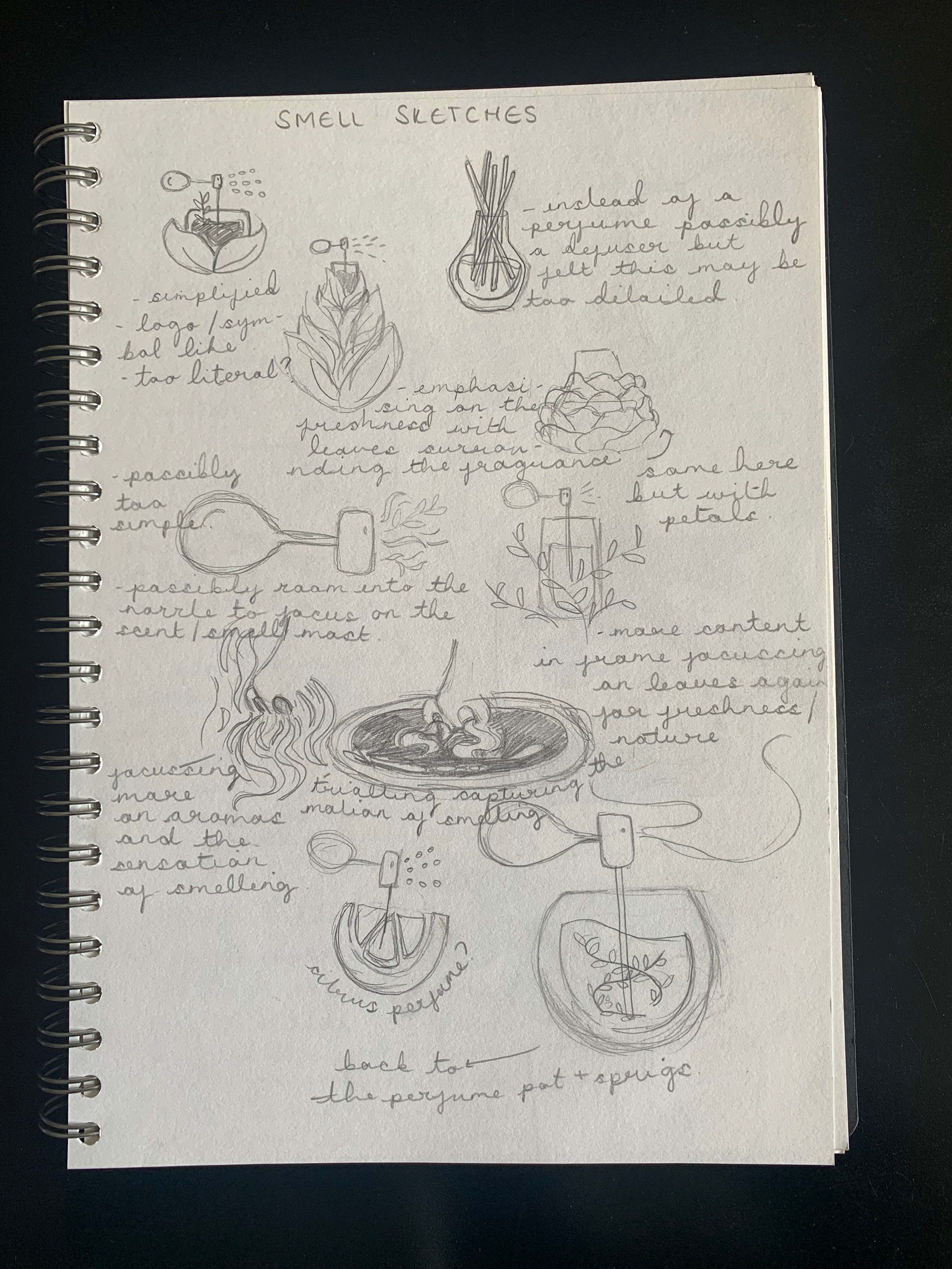
Smell research:

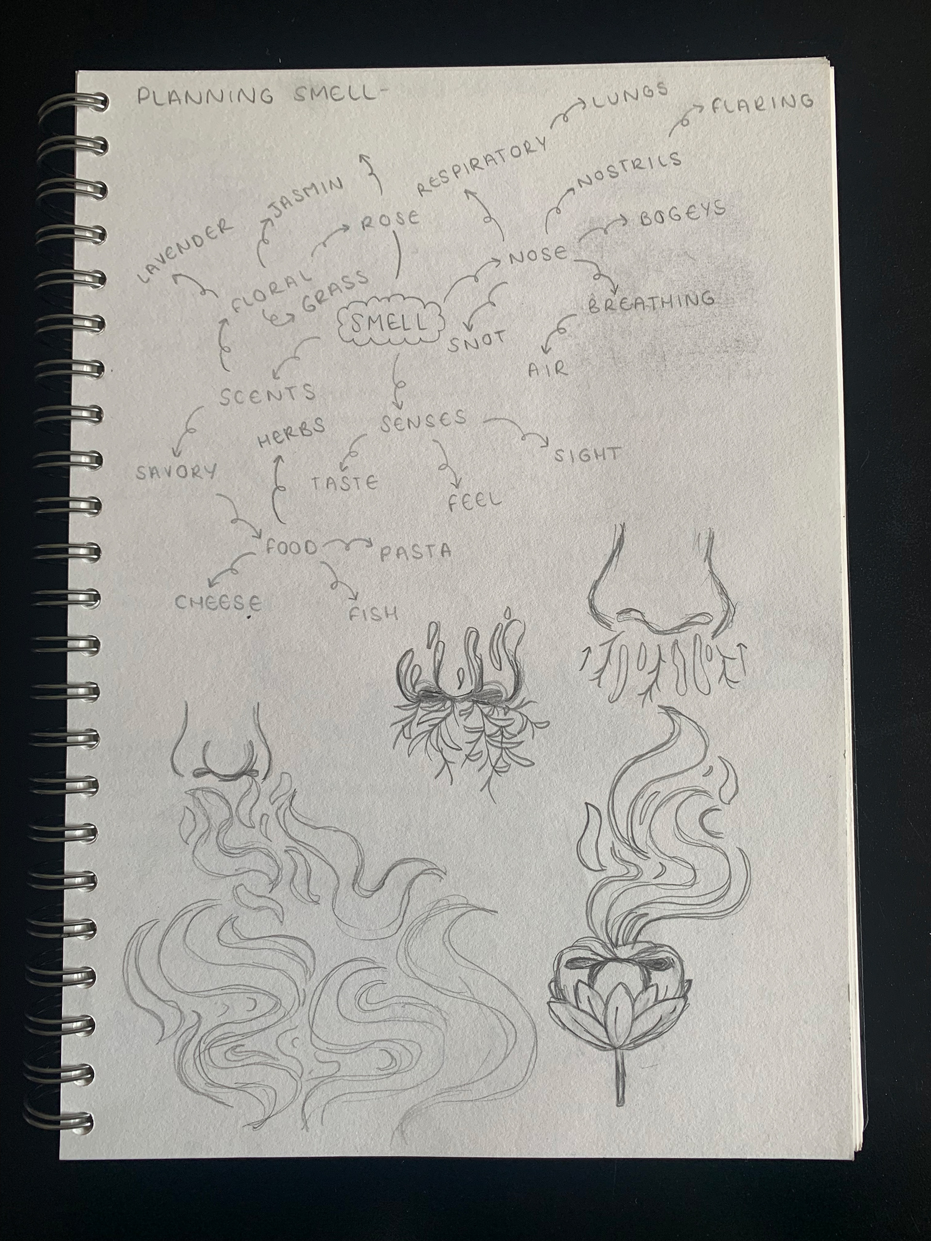
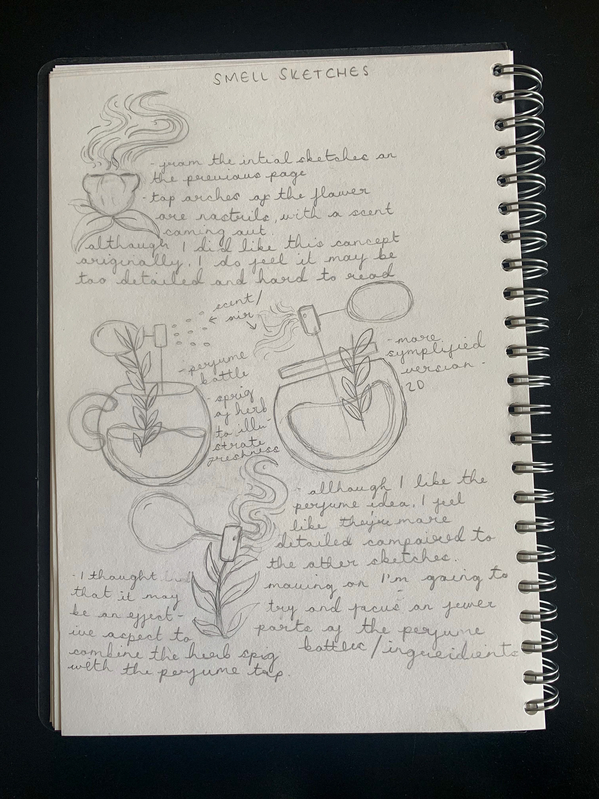

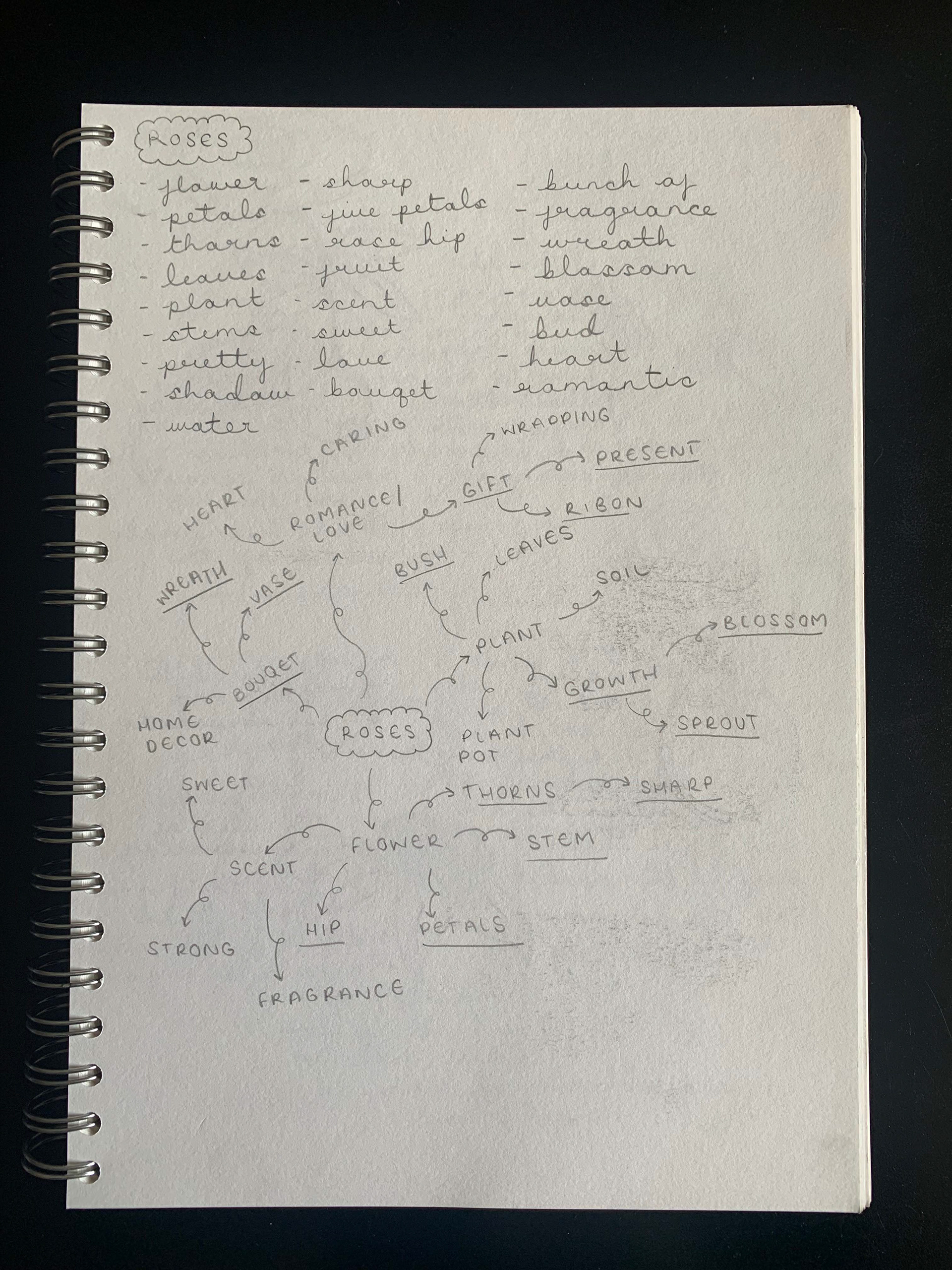
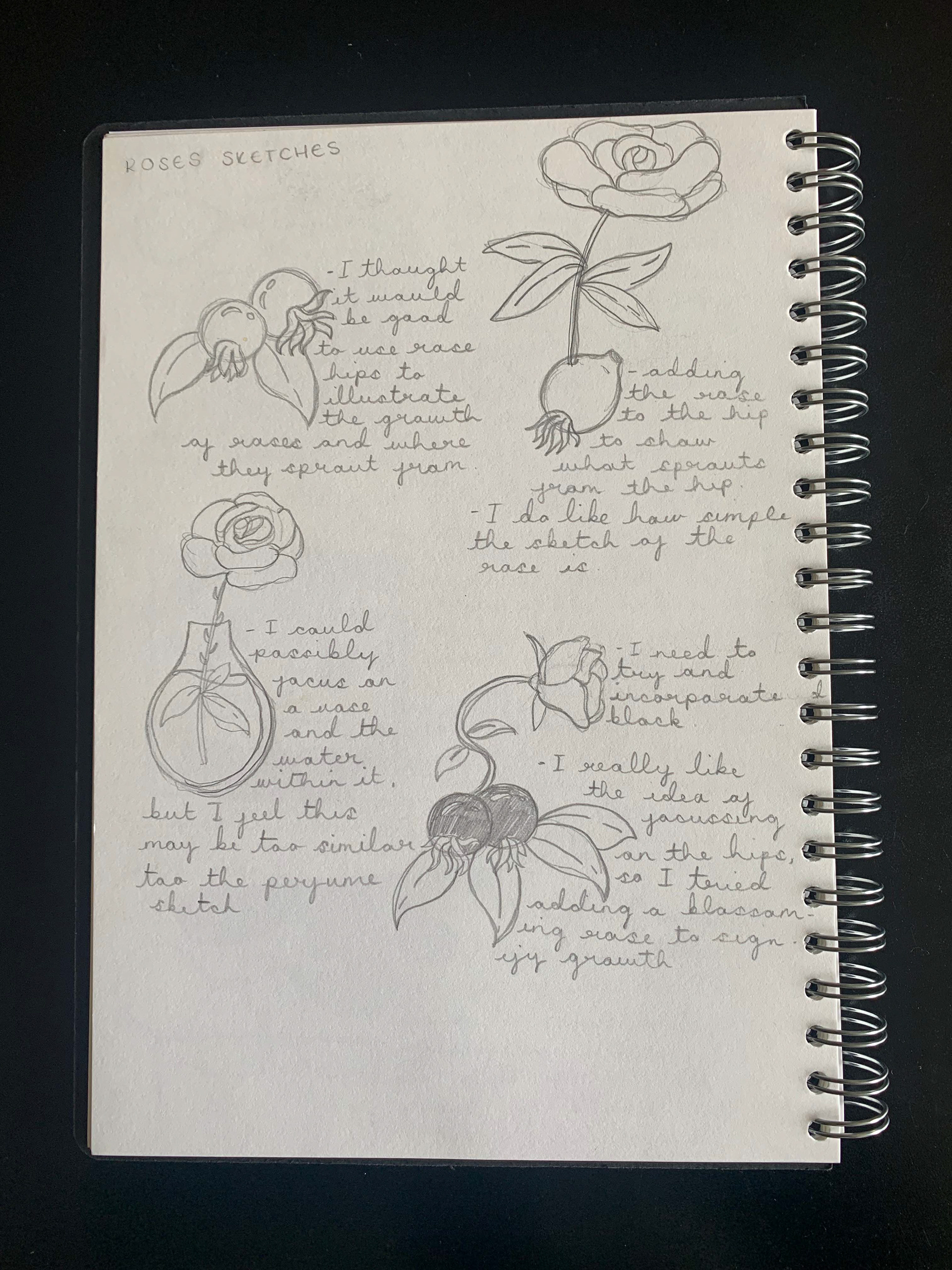
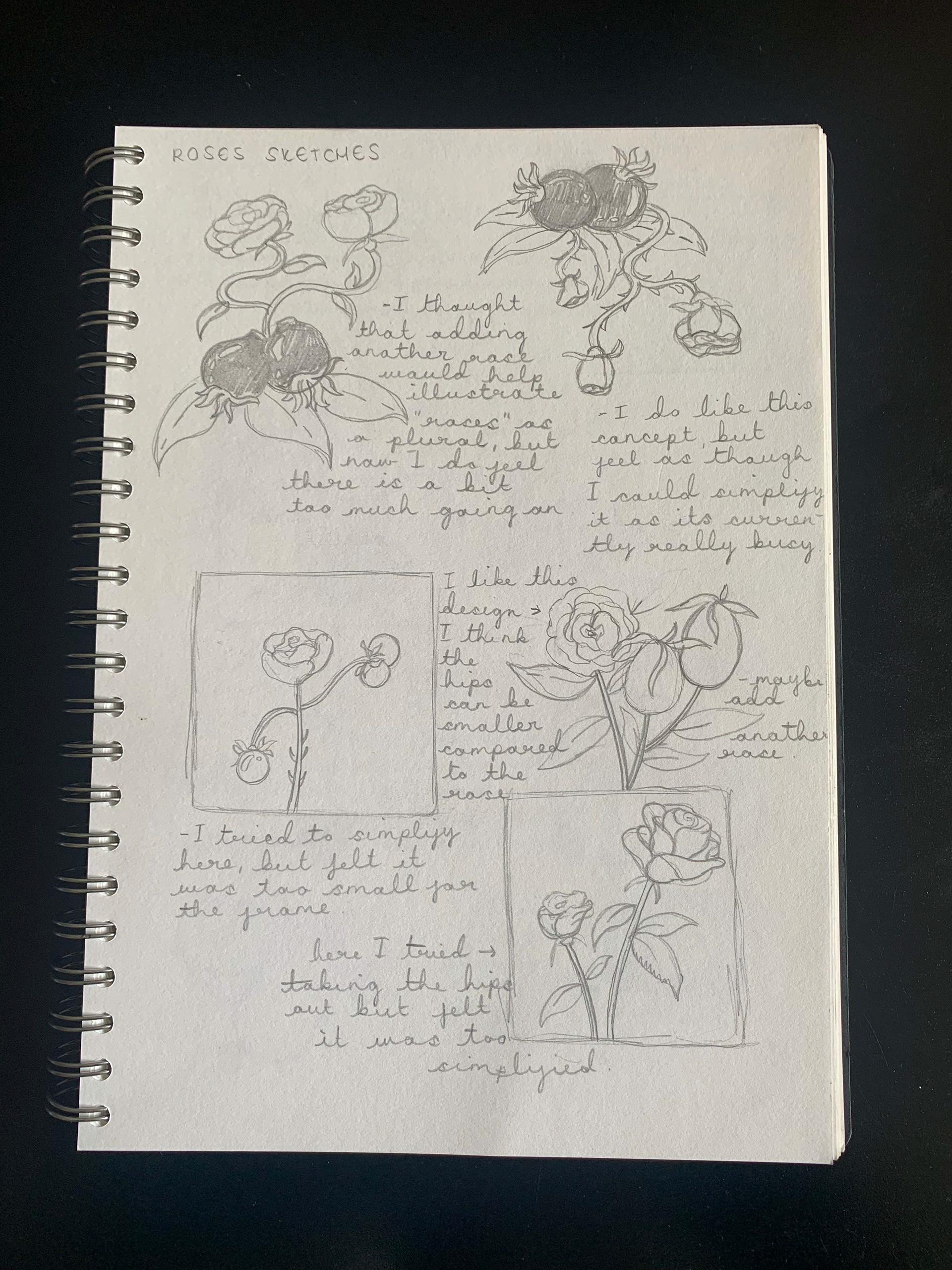
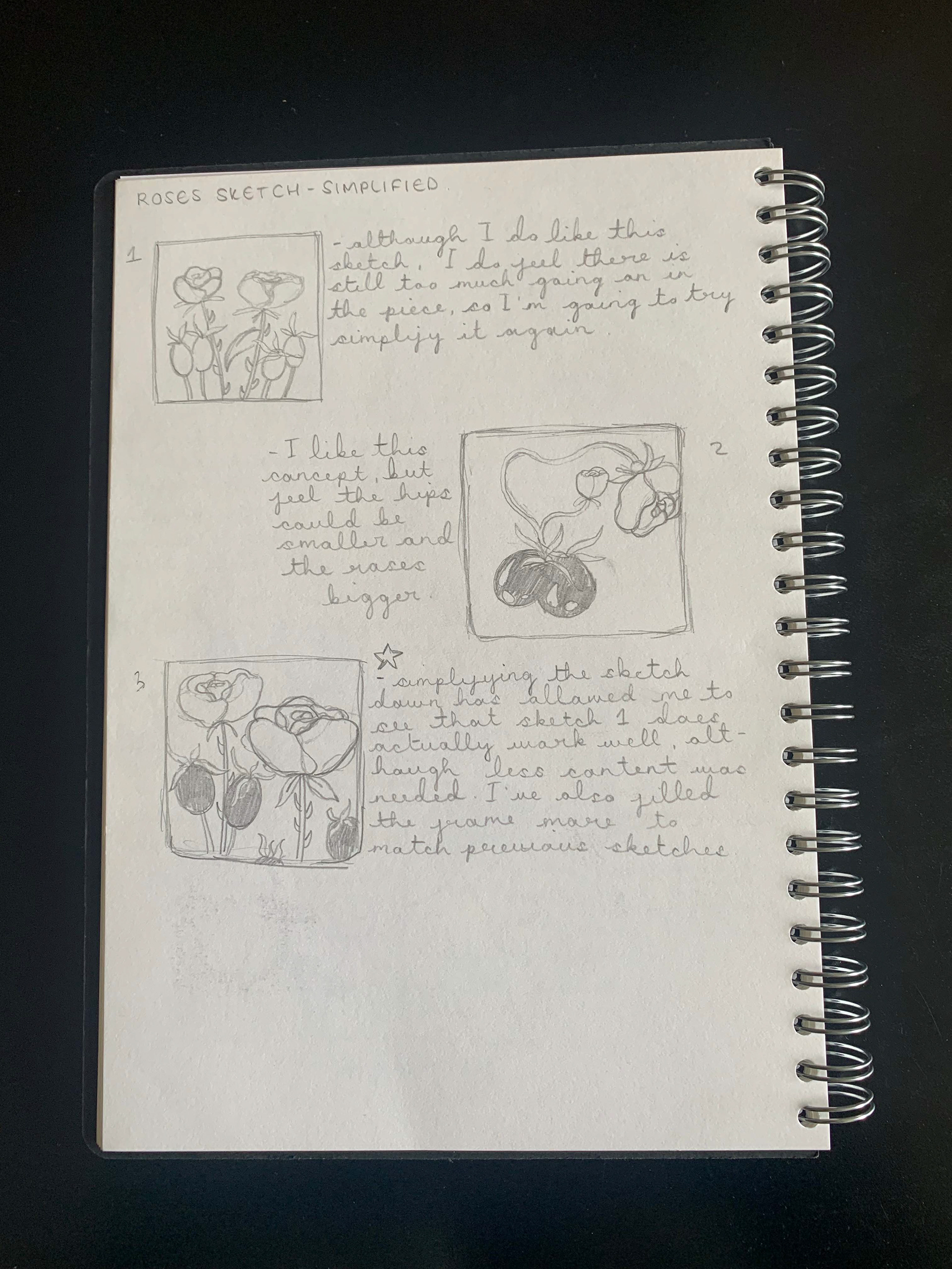
Roses research:
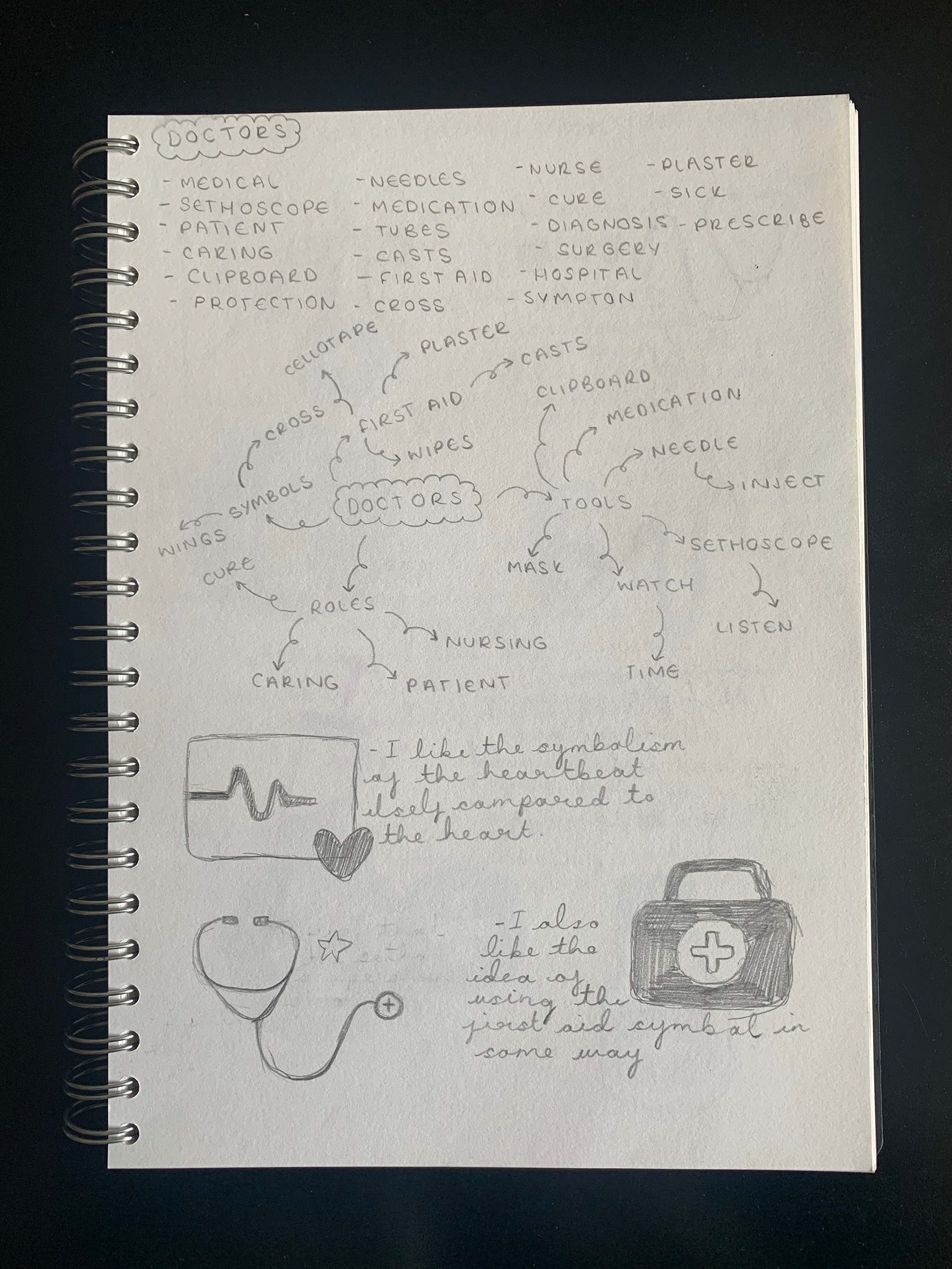
Doctors research:
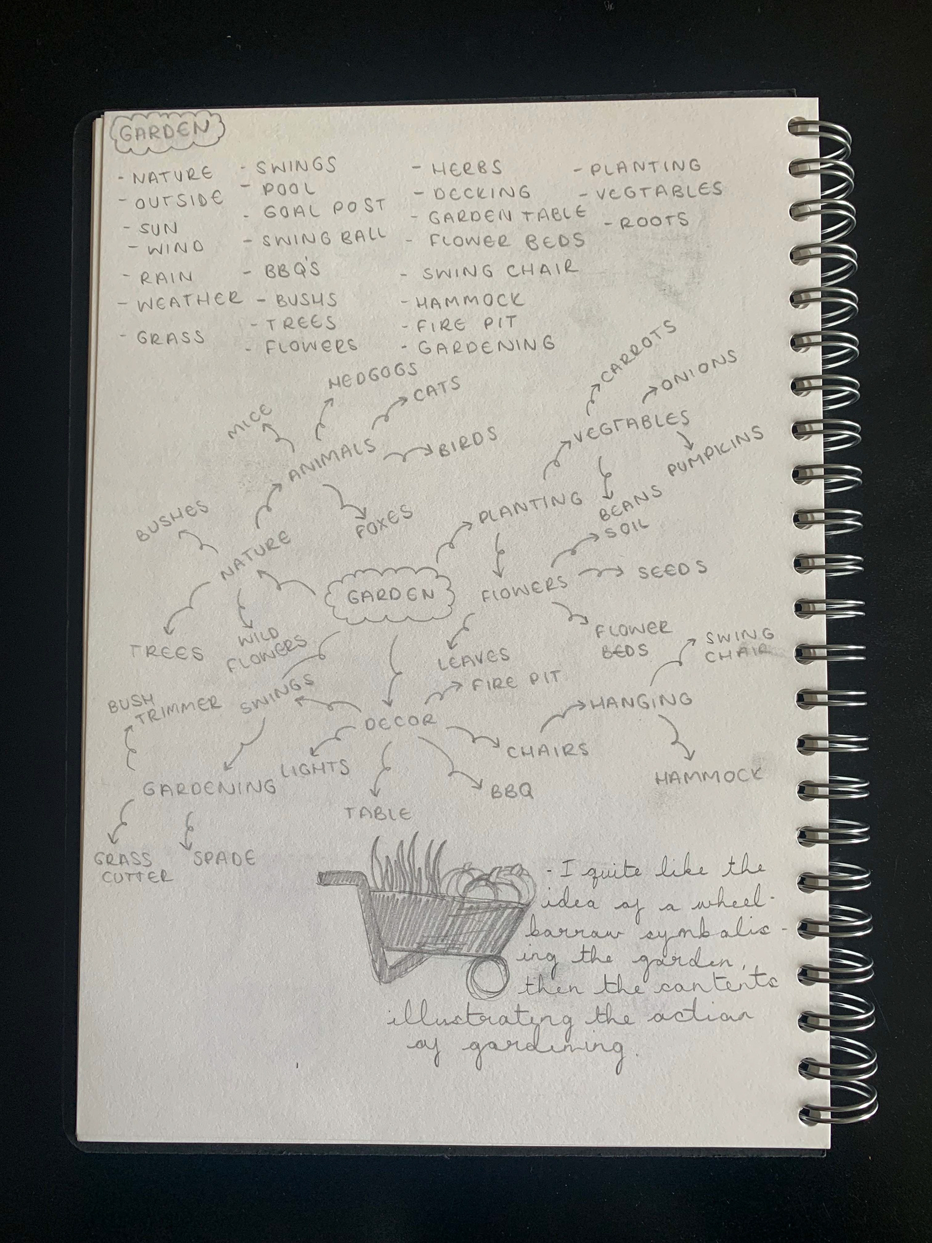
Garden research:

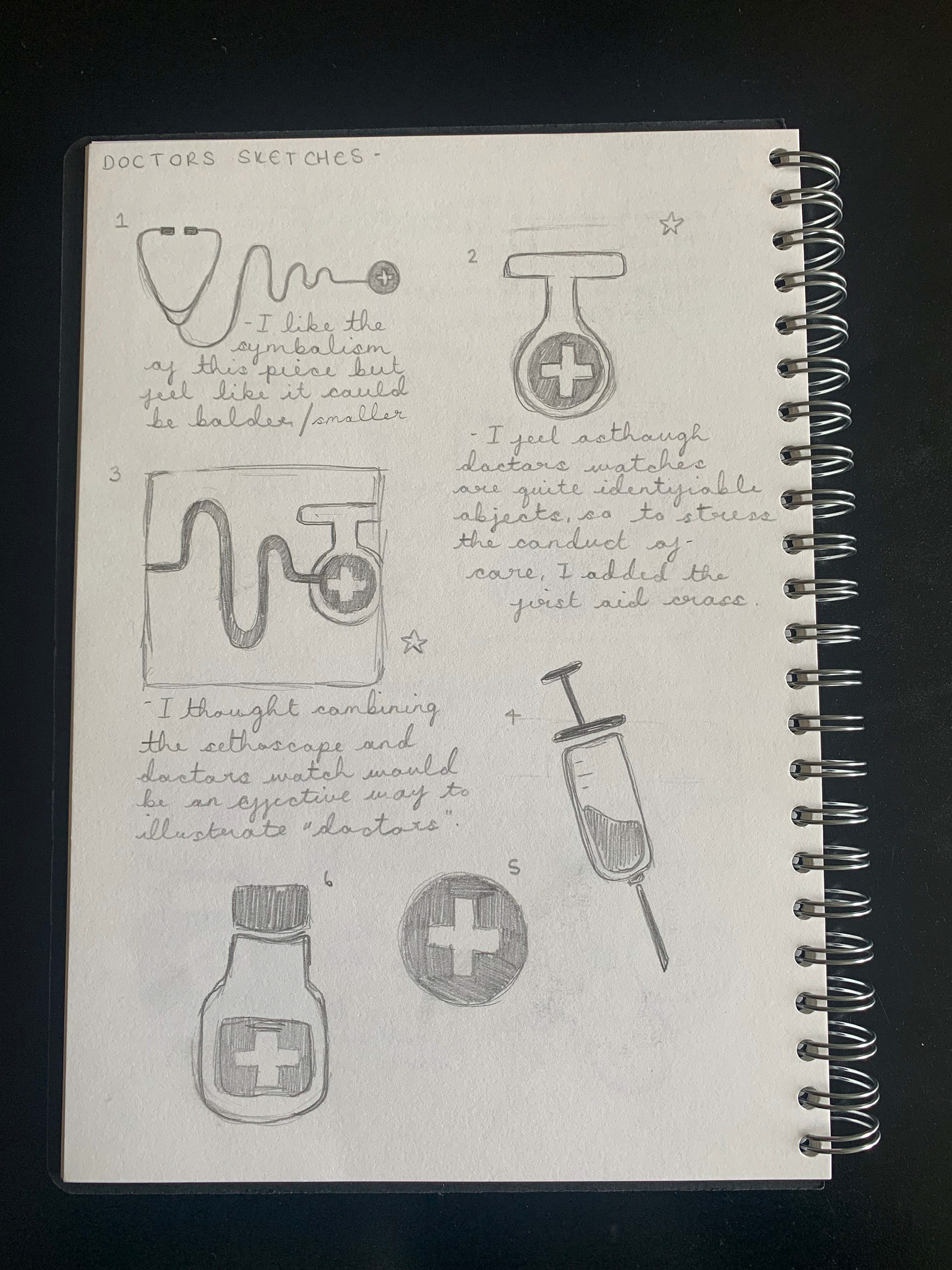
Following my research and initial sketches, I decided to collate all of the information found into six designs.
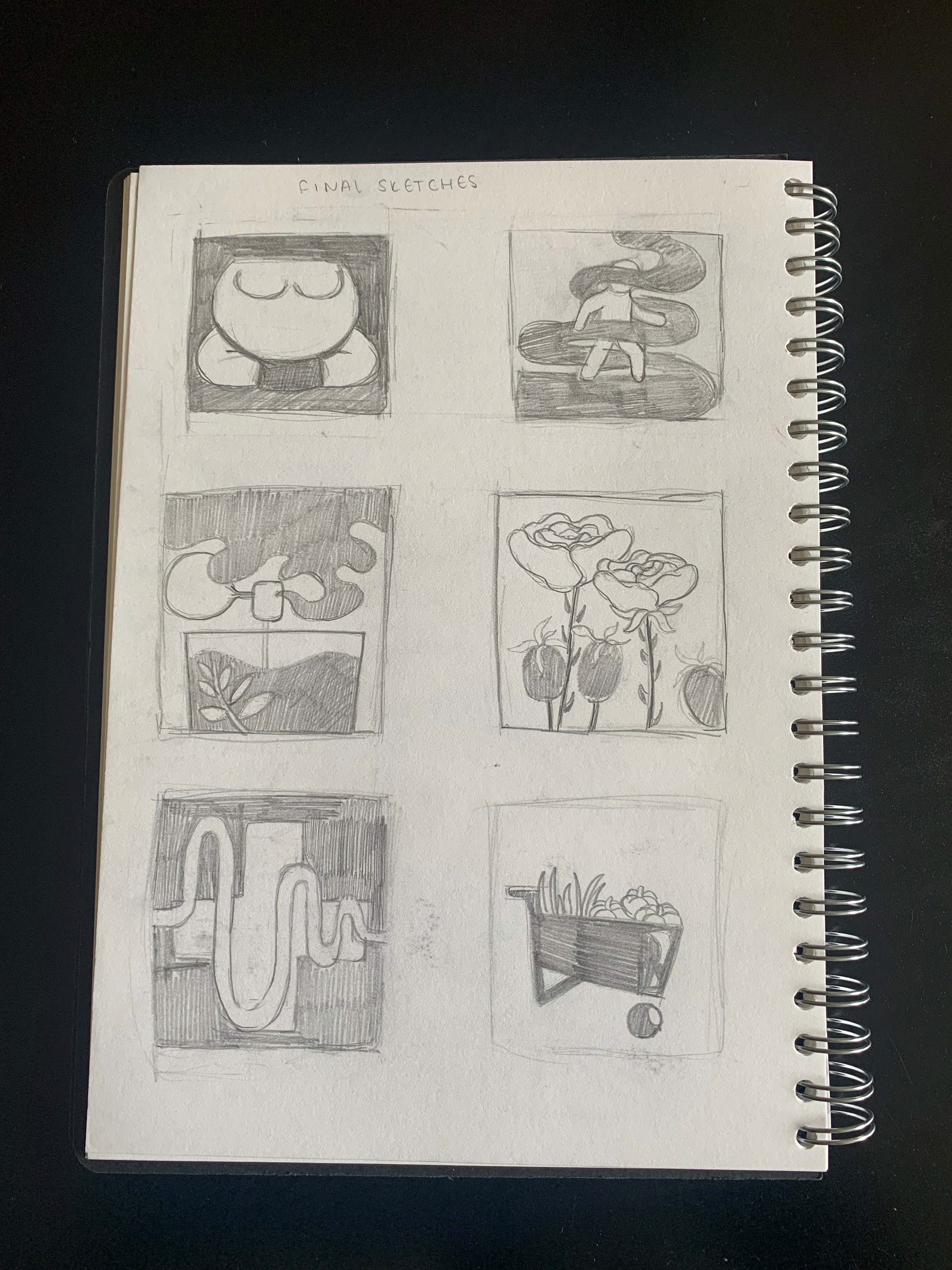
After looking over these illustrations, and working through the simplification workshops,
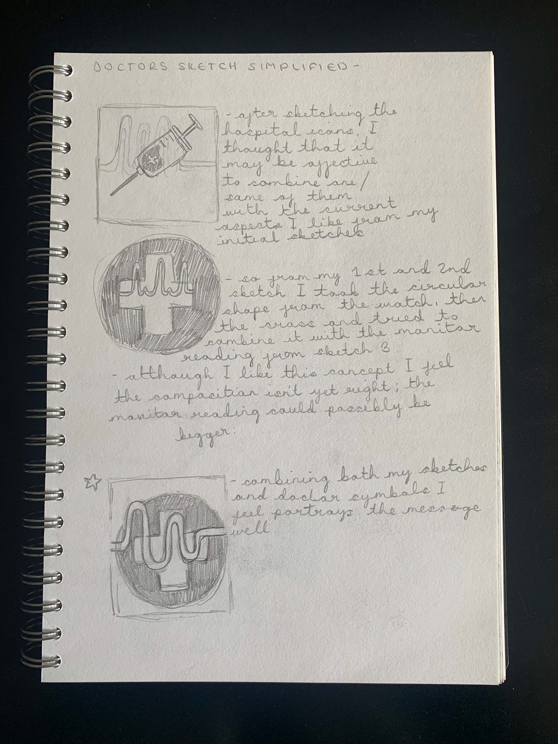
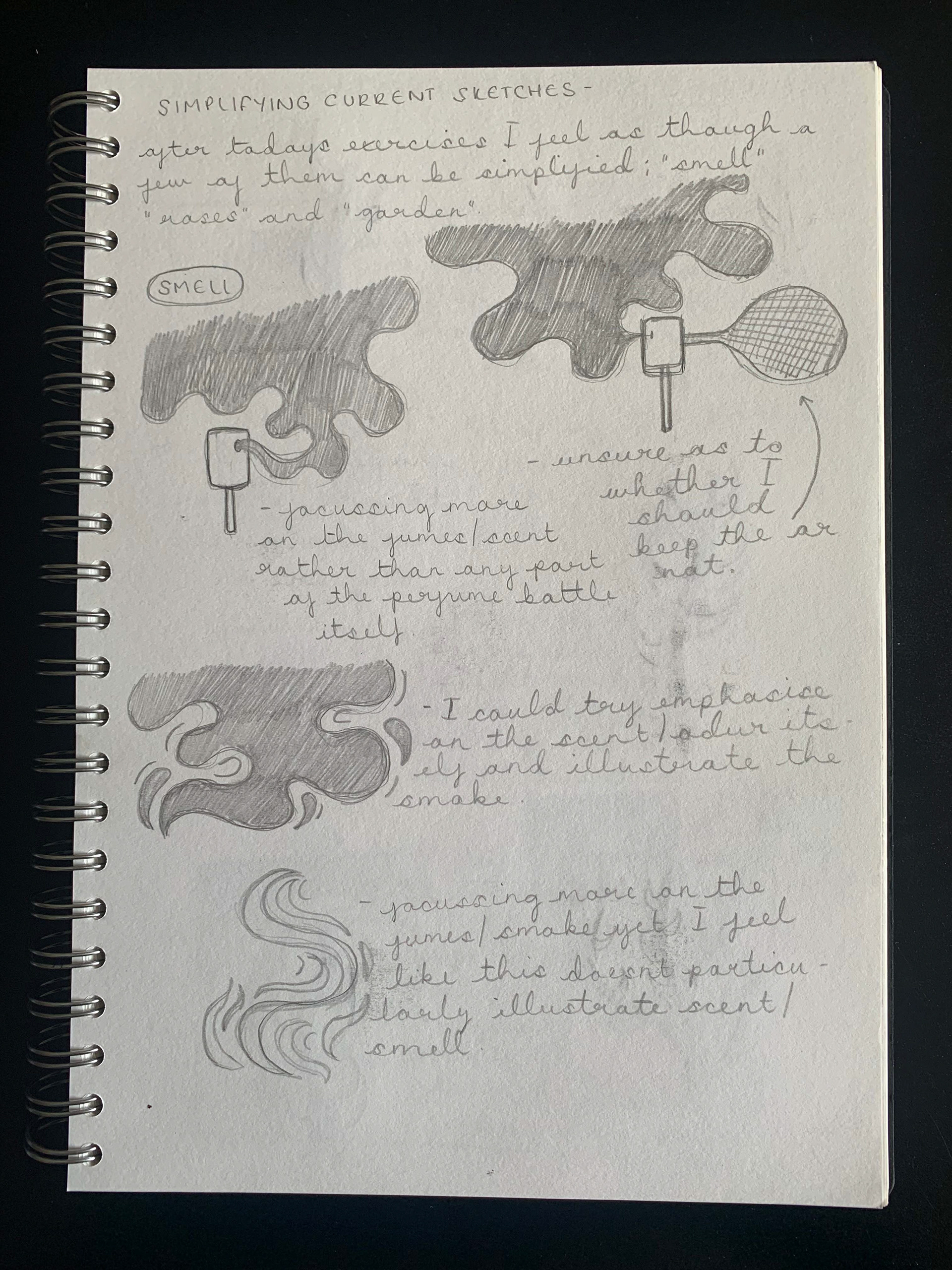
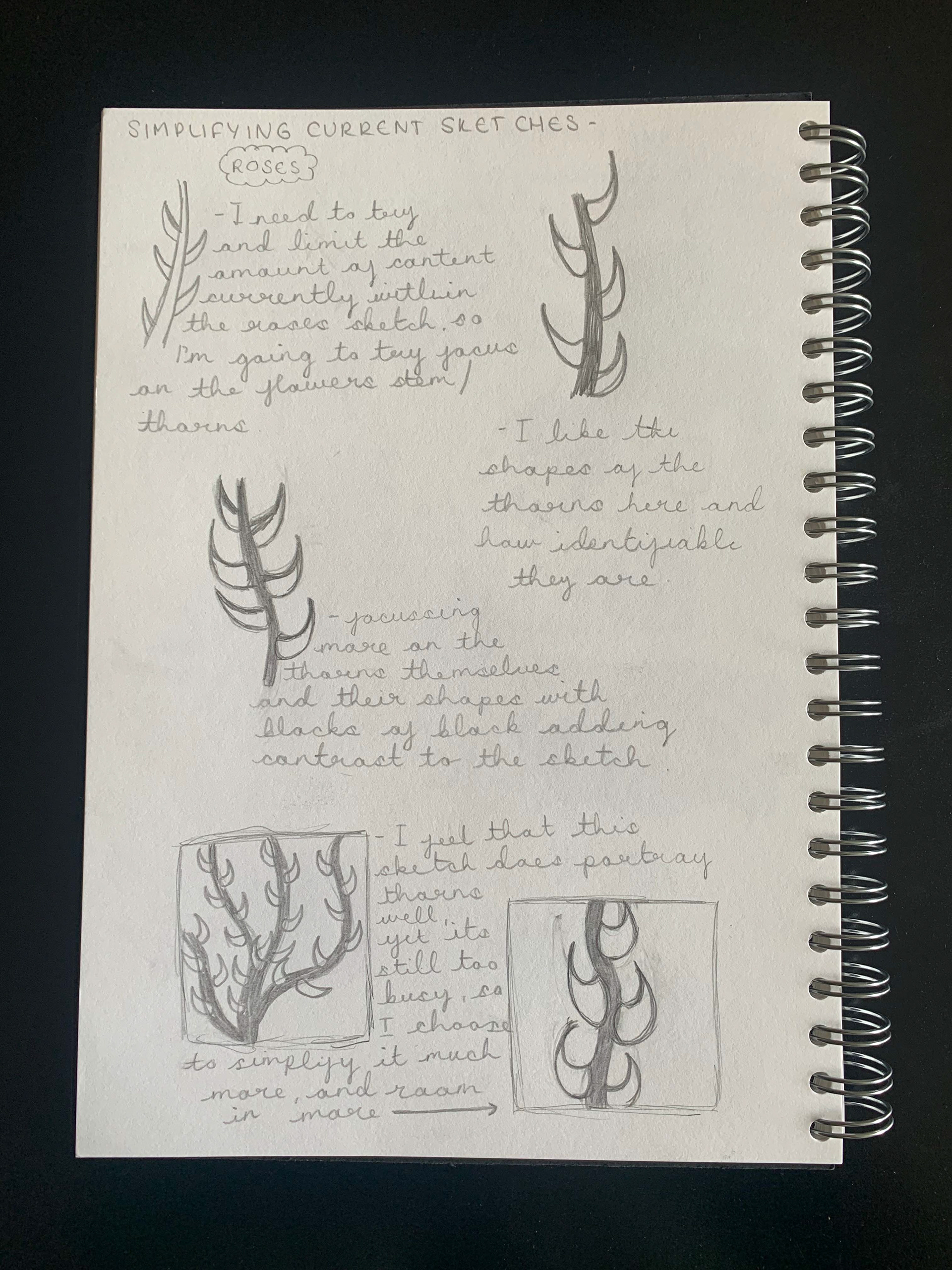
I realised that the designs I had drew were more detailed illustrations than graphic designs. So, using the techniques learnt, I started to simplify the more detailed designs. For this I focused more on key shapes and line work that represent the imagery
and therefore the word.
I realised that the designs I had drew were more detailed illustrations than graphic designs. So, using the techniques learnt, I started to simplify the more detailed designs. For this I focused more on key shapes and line work that represent the imagery
and therefore the word.
Simplifying Smell, Roses and Garden:

Once I had the final designs simplified, I started to think about the presentation of this unit. Knowing I would be making a digital logo from combining these six images next,
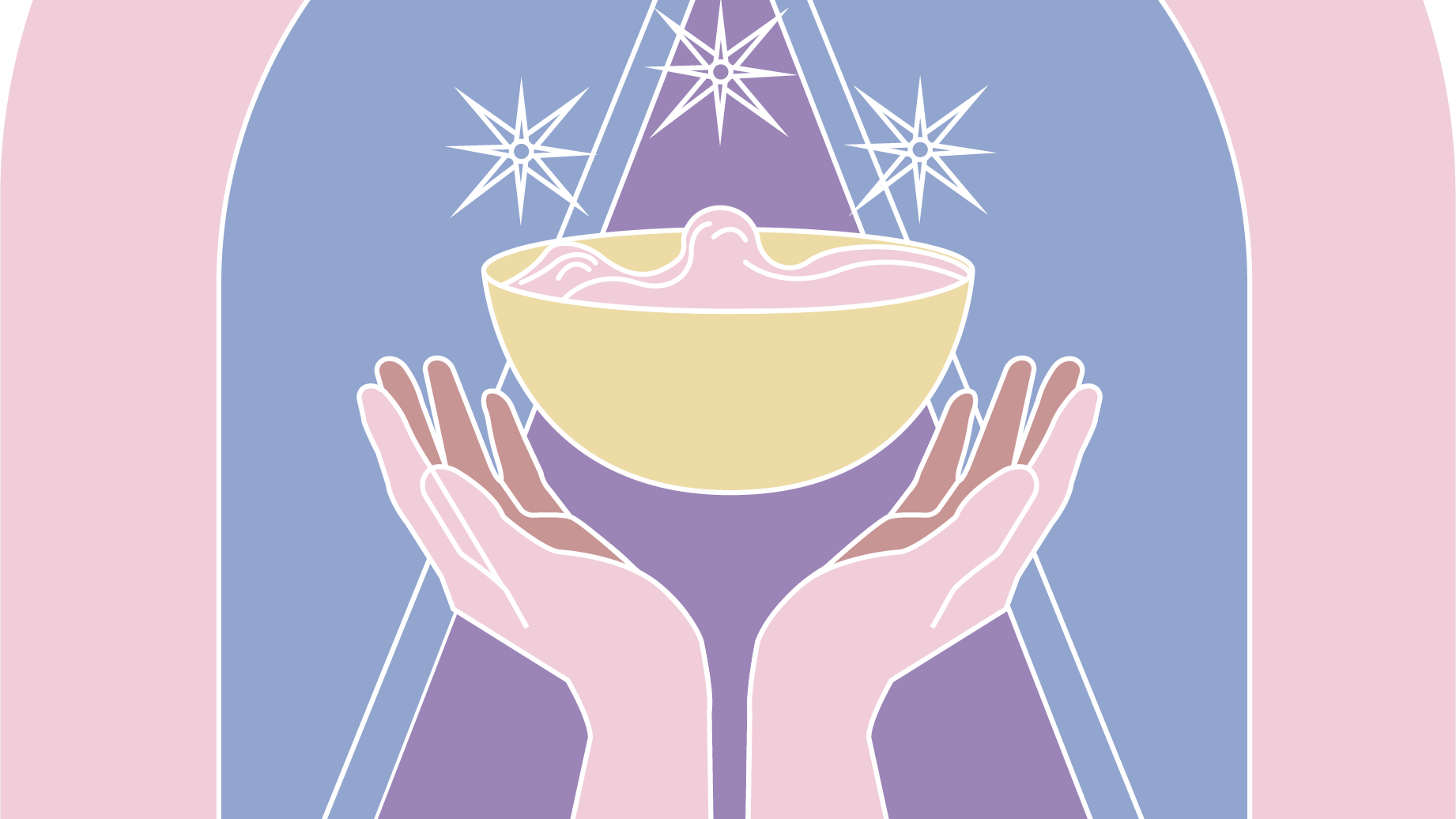
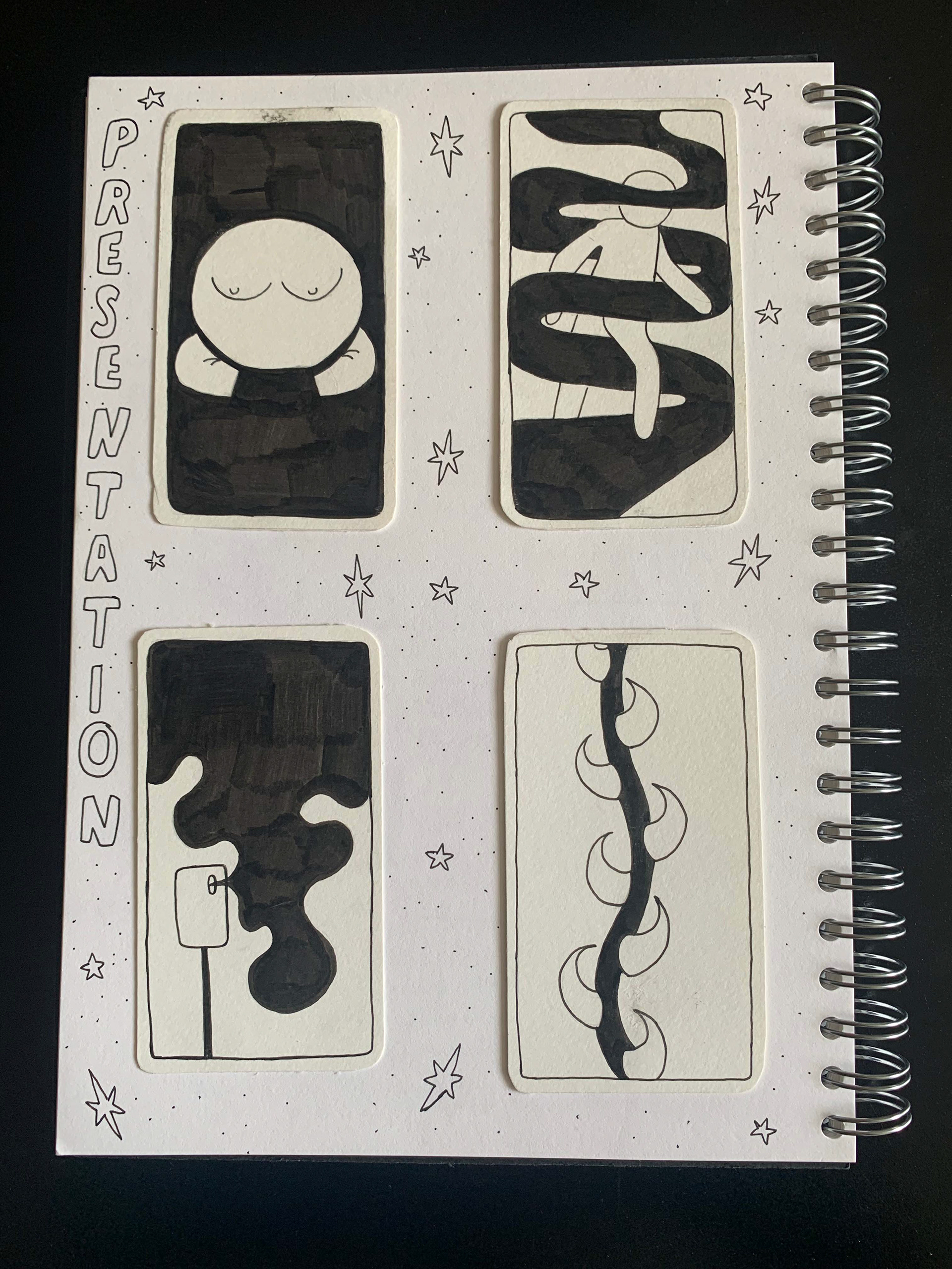
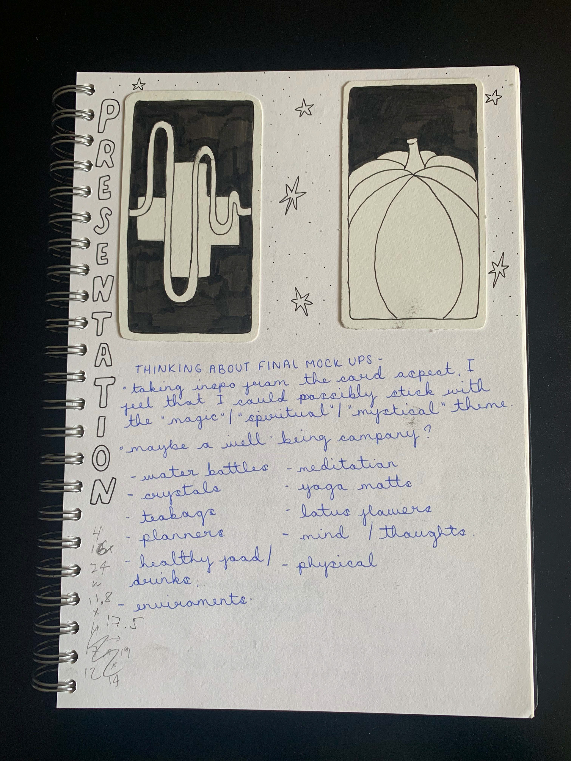
I felt that an effective way to present both the logo and designs would be to make them into tarot cards. To start this process, I cut out pieces of card to resemble the shape of tarot cards, then inked the designs I had at the time.
I felt that an effective way to present both the logo and designs would be to make them into tarot cards. To start this process, I cut out pieces of card to resemble the shape of tarot cards, then inked the designs I had at the time.
Presentation draft - Tarot Cards:
To start the process of creating a digitalised logo from these images, I took photos of each of the inked designs then drew over them in Procreate. Following this, to be able to alter individual factors of each of the pieces, and use its tools, I then transferred the designs from Procreate to Adobe Illustrator.
Digitalised designs:

Once I had the designs in Illustrator, I began to simplify each of the pieces down to one factor which I could then implement into a logo. For this, I was looking for identifiable shapes and strokes.

Extracting these factors from each of the design helped towards starting the process of visualising the digital logo, as I now had solid foundations to start from. Using these foundations I began to experiment with combining some of them to see the outcome.
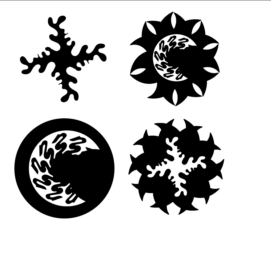
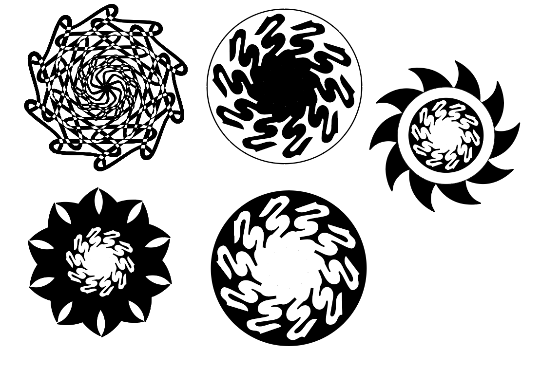
Although I liked these designs so far, I didn't feel completely happy with them or as-though they were particularly in a style I'd usually use. So, taking this into consideration and following our workshop regarding branding, I chose to focus more on creating a branding logo. To start this I began to research what type of brand I felt the designs I had already created would be effective in illustrating.
Brand research:
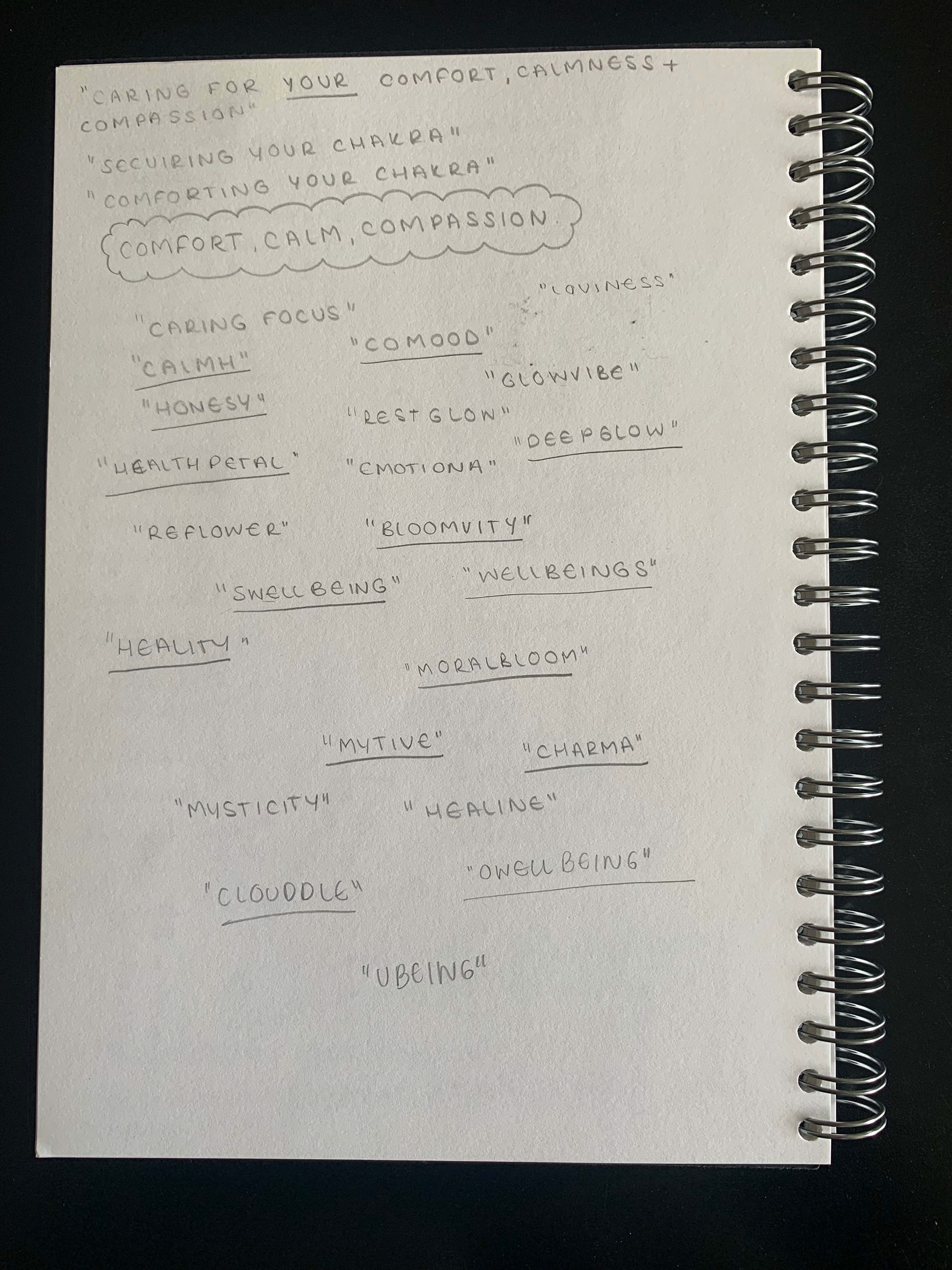
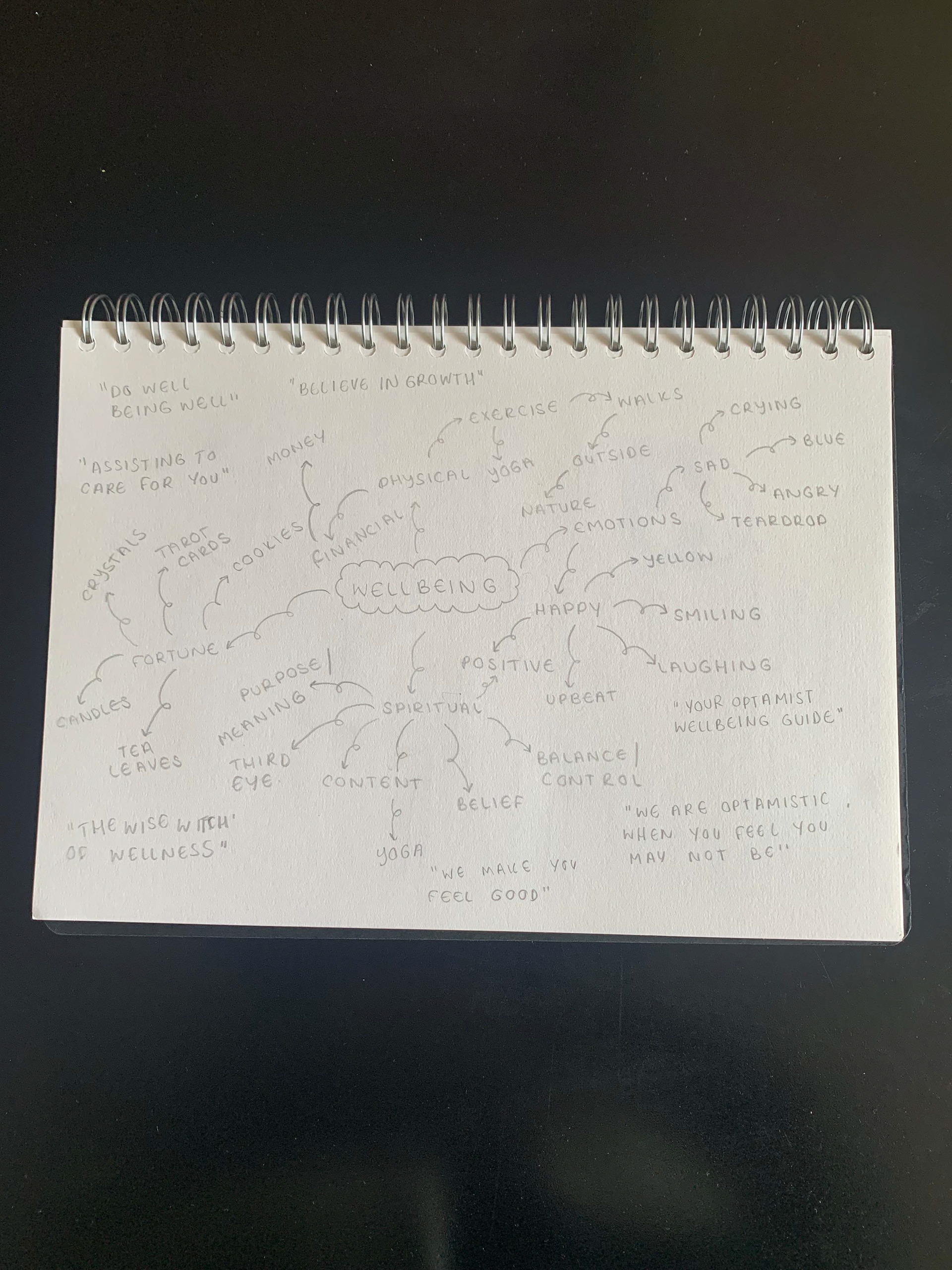

As it can be seen, I felt that a wellness brand would fit well for the logo, following on from the idea to present this unit as tarot cards. Knowing this, I decided to put my pencil back to paper and try to design a logo from the words and themes found within my research stage. As soon as I did one sketch, I knew that I loved the outcome and began to digitalise the idea.
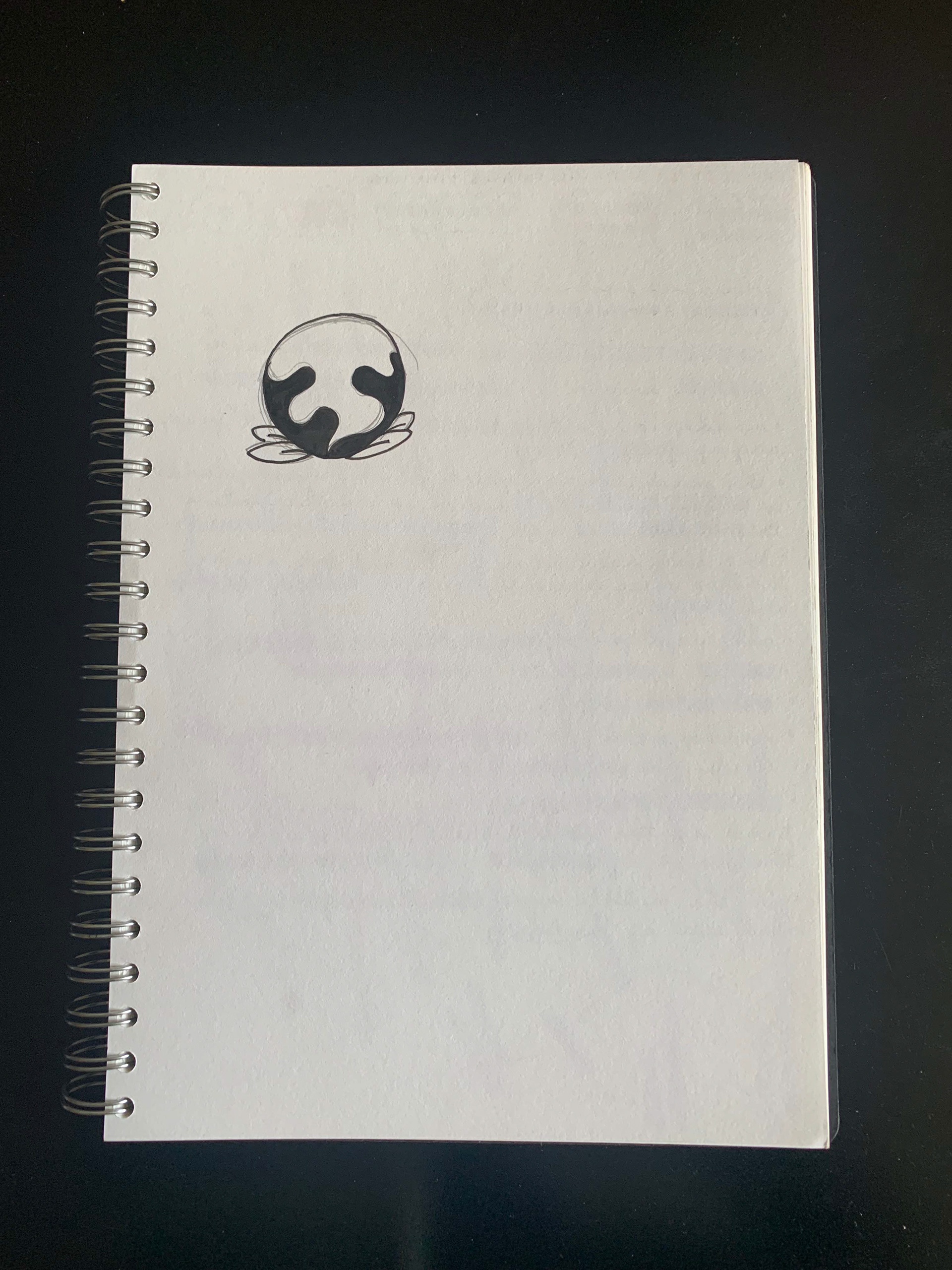
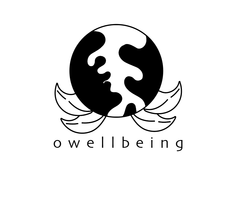
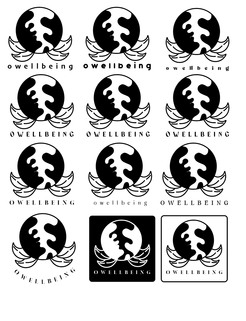

Using the circle shape of the pumpkin for 'garden', the thorn shapes from 'roses' and the scent shape from 'smell' I was able to come up with a logo which I felt represented the brand I had created well. Once I had the key logo in place to ensure that I had tried all avenues, I started to experiment with key-lines, inverting, contrast, weight and font (as can be seen above) which brought me to my finalised logo.
Final Logo:
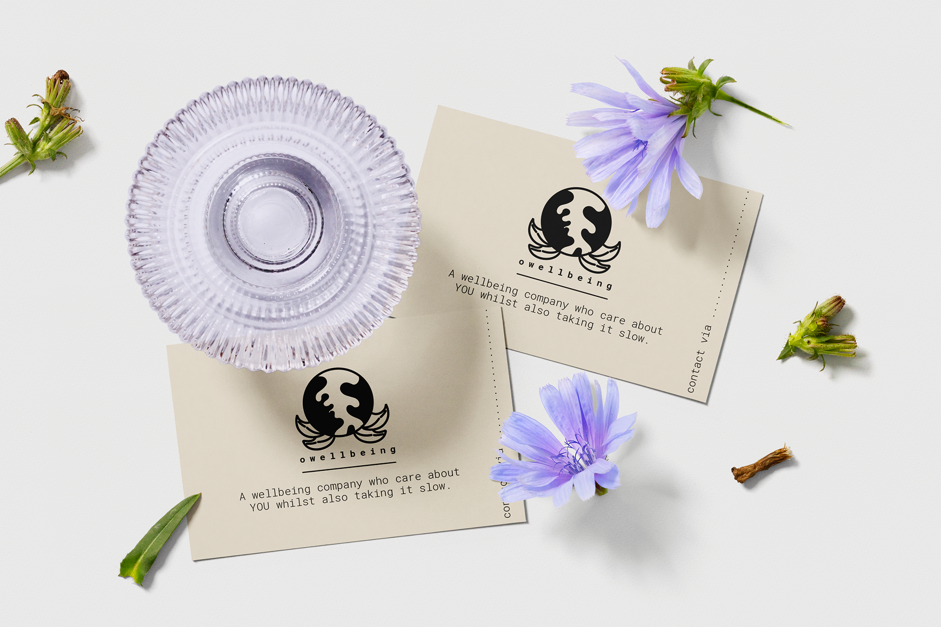
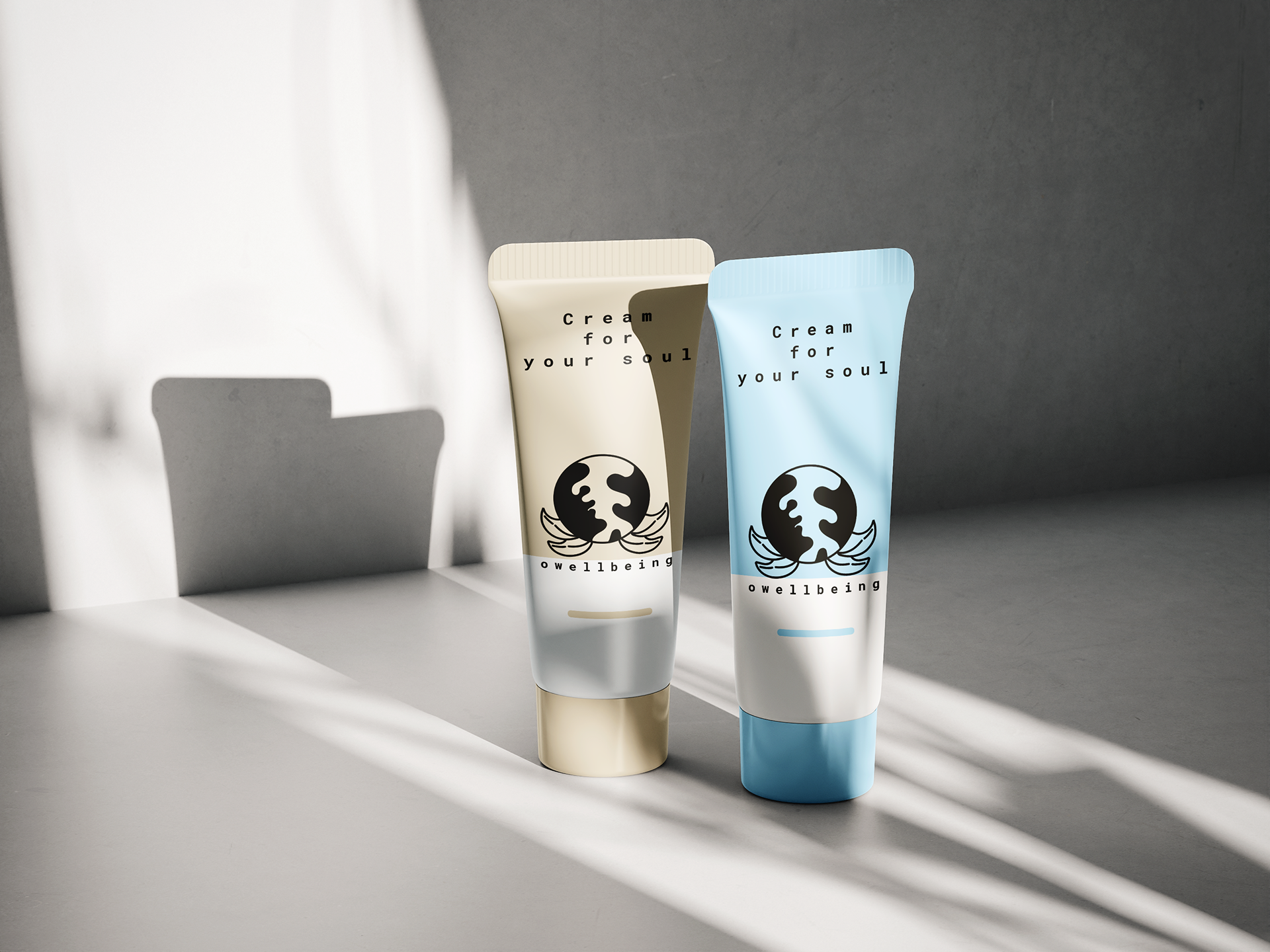
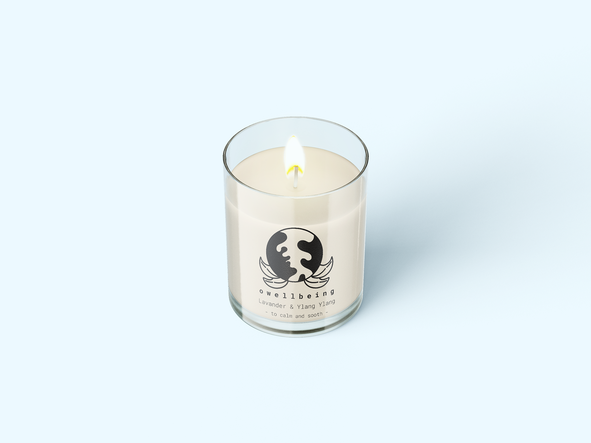
Once I had my logo I began experimenting with mock ups for wellness products which I felt fitted with the 'owellbeing' brand.
Mock ups:
