UNIT TWO
In this unit we were asked to focus on image manipulation and how this process can benefit the planning methods of a design. To practice this, we were firstly given five words, my five words were:
| Madder Brown | Oscar Wilde | Moby Dick | Bethlehem | 0 |
Taking these words, five images had to be created were all the separate words had to be featured (emphasising on one of the themes in each image).
MADDER BROWN IMAGE
Here I emphasised on the madder brown swatch by using the layer blend technique. Using an image of the swatch, I cut around the mountains (referencing to Moby Dick), so that the image of the colour could sit on top of the mountains. Then, by using a layer blend, I made the red the emphasised factor within the image, and placed the other aspects based on the red mountains (Coke Cola bottles - Oscar Wilde | Pink Arches - 0 |
Bethlehem Star - Bethlehem).
Bethlehem Star - Bethlehem).
OSCAR WILDE IMAGE
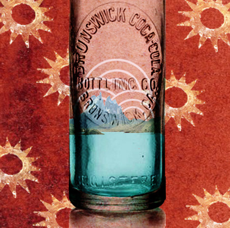
Here I focused on the Oscar Wilde image (Coca Cola bottle). To make this the main focal point of the image I made sure that it was the biggest aspect in the frame. Then, to combine the other factors I: placed the mountains in the bottle (Moby Dick), framed the mountains with the pink arches (0), made the background Madder Brown (Madder Brown) and patterned the Bethlehem stars on top of this (Bethlehem).
MOBY DICK IMAGE
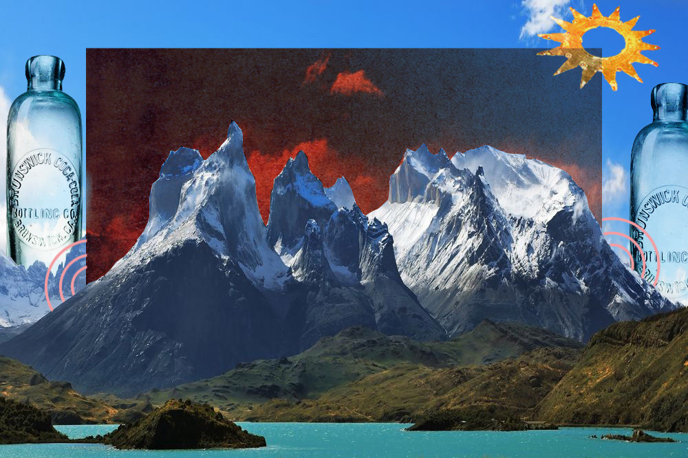
Here I focused on ensuring the mountains (Moby Dick) were the most emphasised aspect within this image. To do this I sat all the other contents around the image making sure it was the focal point for the viewer. To do this I sat the Madder Brown swatch behind the mountains arches as if it was in the sky, the Nativity (Bethlehem) star again, in the sky, the Coke Cola bottles (Oscar Wilde) either side of the mountains, and the pink arches (0) at the base of each side of the swatch for framing purposes.
Bethlehem Image
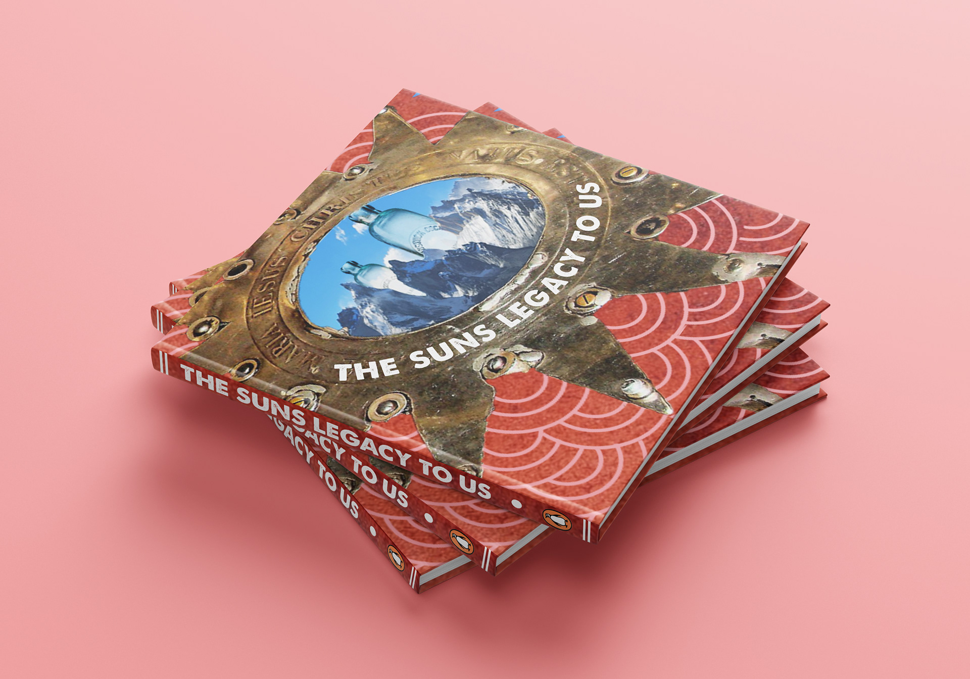
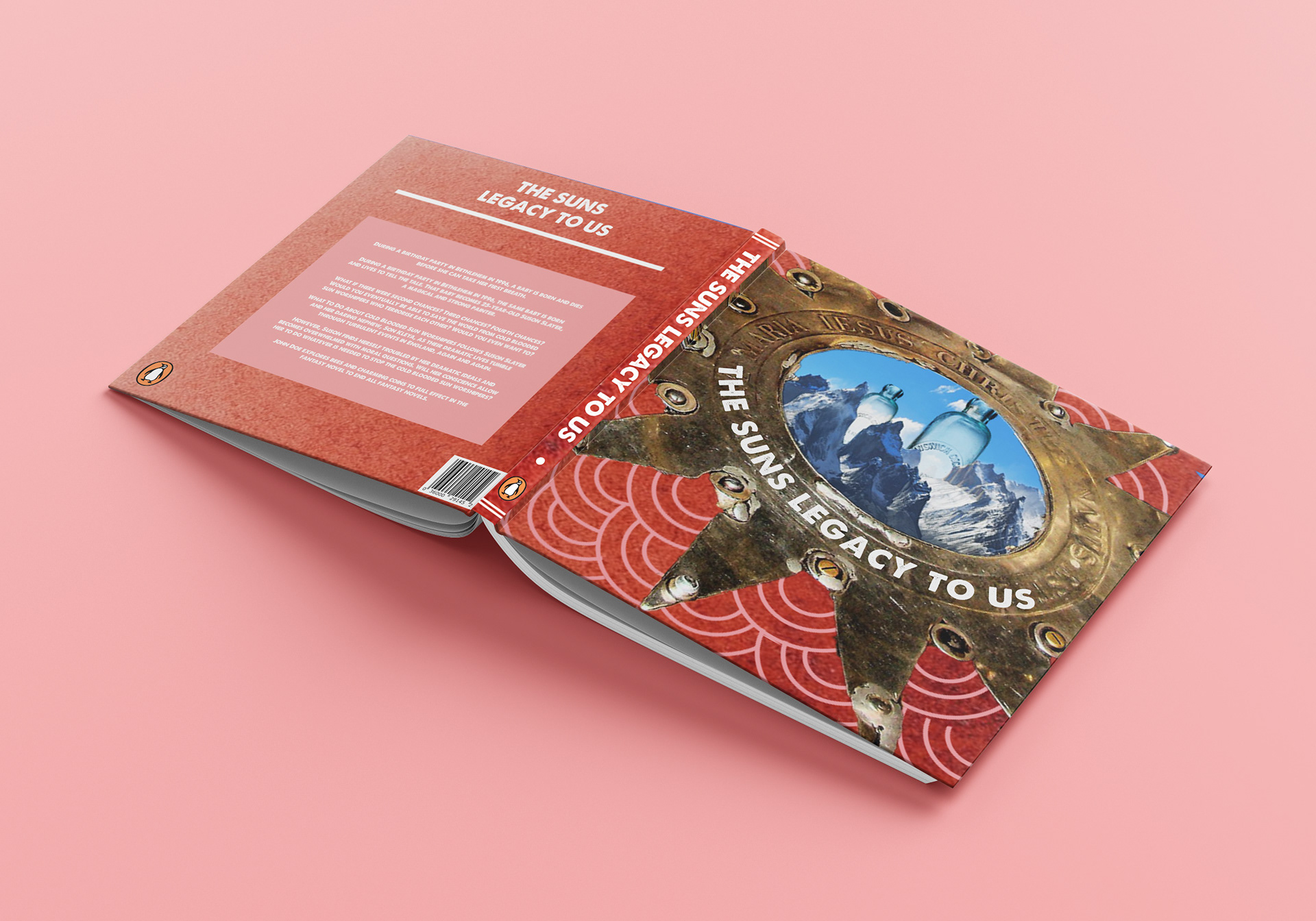
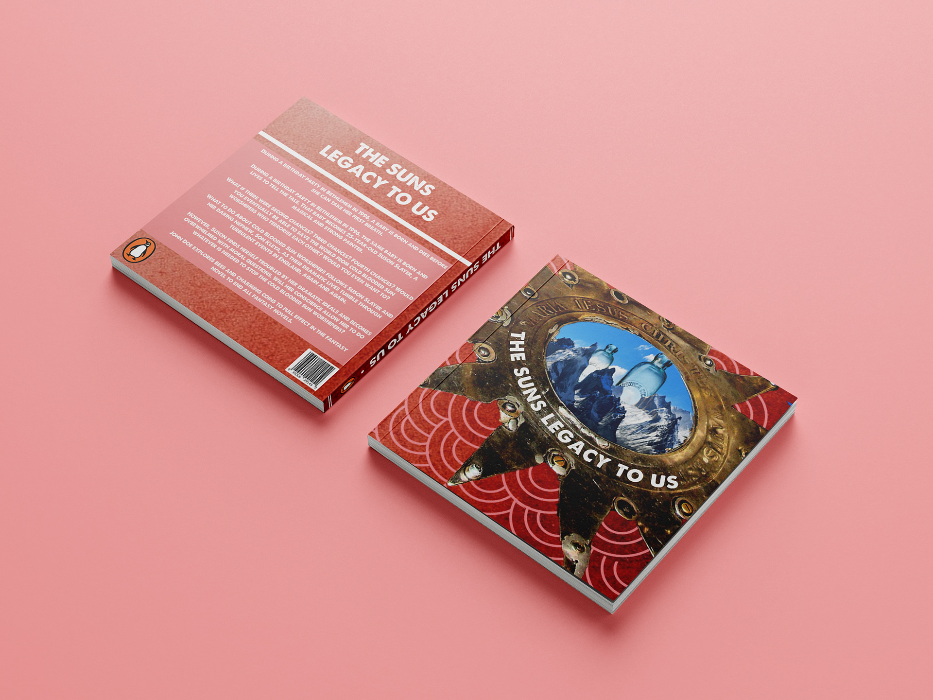
Focussing on the star which is based in the Nativity Church in Bethlehem, I again, made sure it was the biggest factor if the image by ensuring it cut by the frame. Then, to include the mountains (Moby Dick), I selected the content and cut it down to fit within the centre of the star (Bethlehem). Again, ensuring the Madder Brown swatch was included, I sat this in the background, then placed the arches (0) to sit around each of the spaces created by the star edges.
0 IMAGE

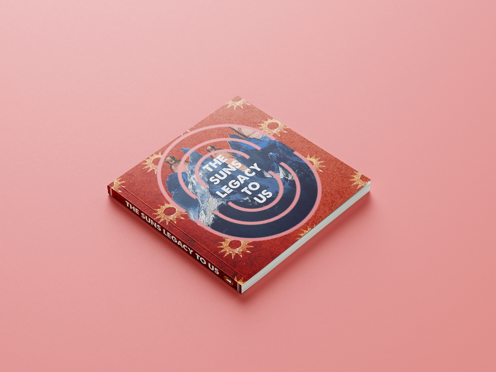
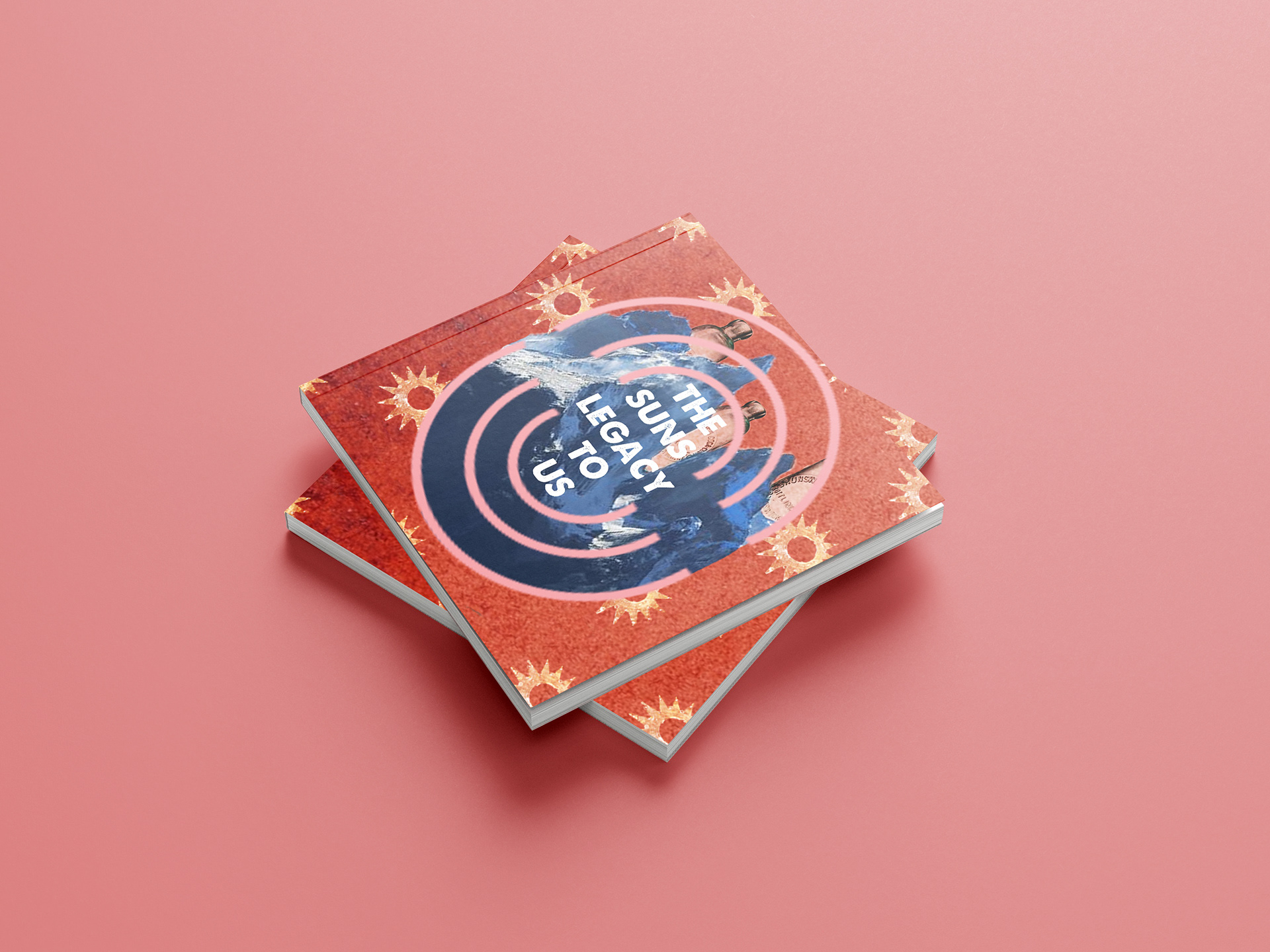
For the 0 image, I decided to use the pink arches to create an outline of the zero digit and as a frame for some of the other factors. As can be seen, I sat the mountains (Moby Dick) within the outer circle of the 0, then blended the Coca Cola bottles (Oscar Wilde) to look as though they were in the same environment as the mountains (Moby Dick). Then, to ensure that the other themes were included, I placed the Madder Brown swatch to sit as the background, and created a pattern out of the Nativity Church star (Bethlehem).
FINAL IMAGES
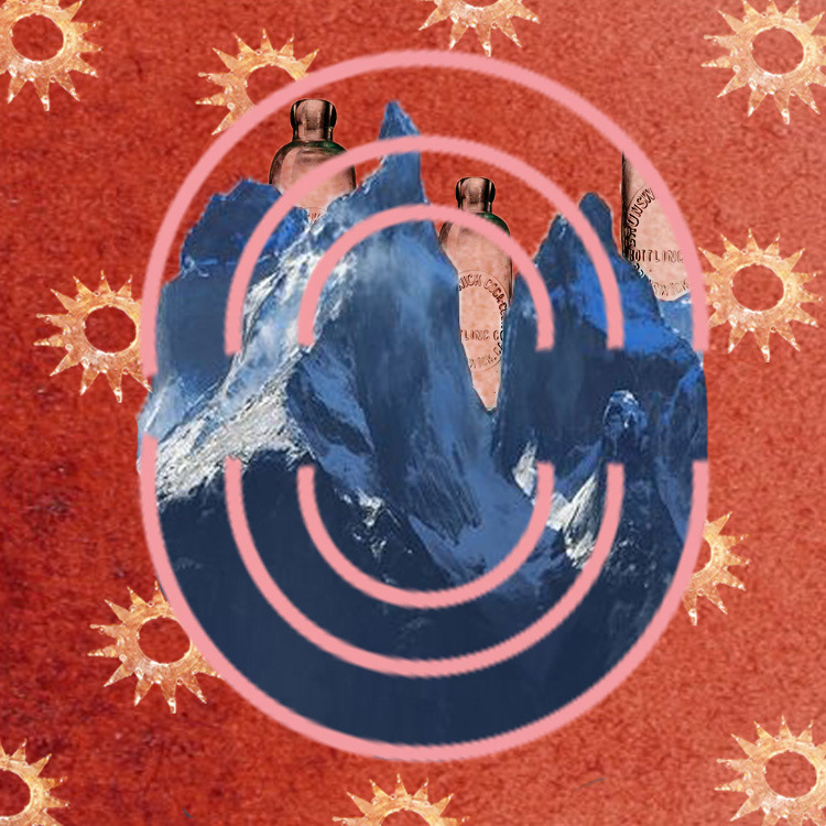

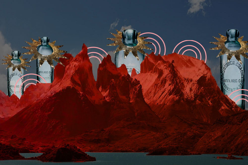
Following creating our combined images we had to choose three of which we would create either a book, vinyl, DVD case out of. Above are the images I chose to create mock ups out of as I chose they had the most potential.
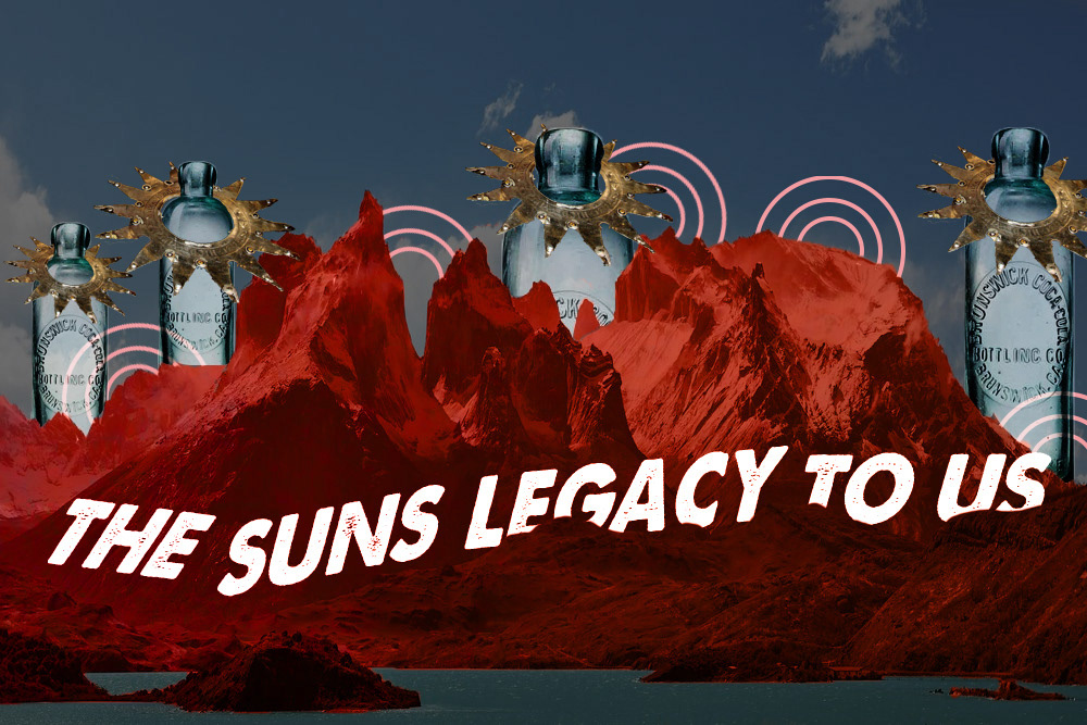
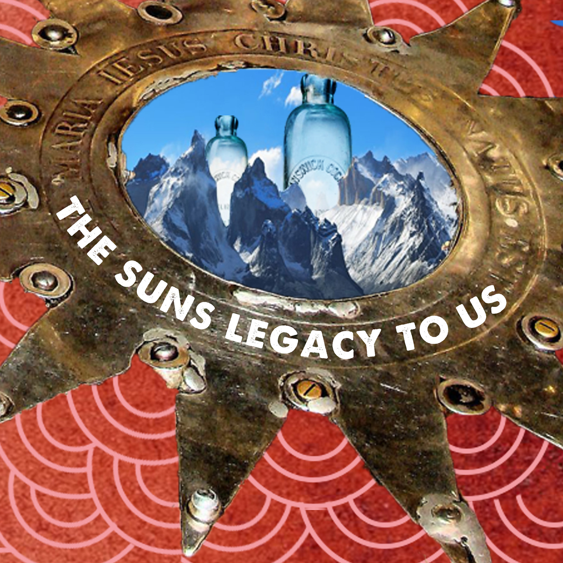
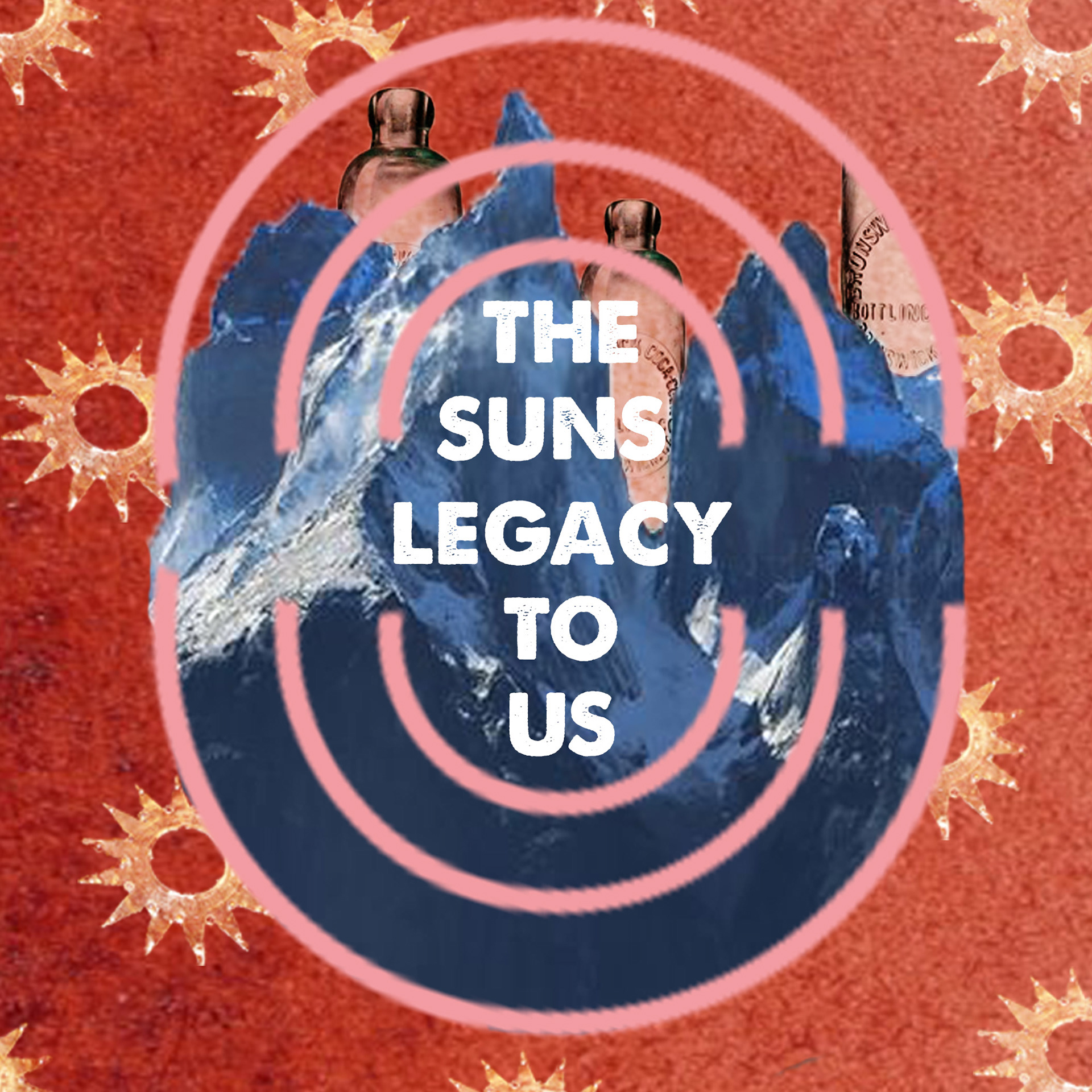
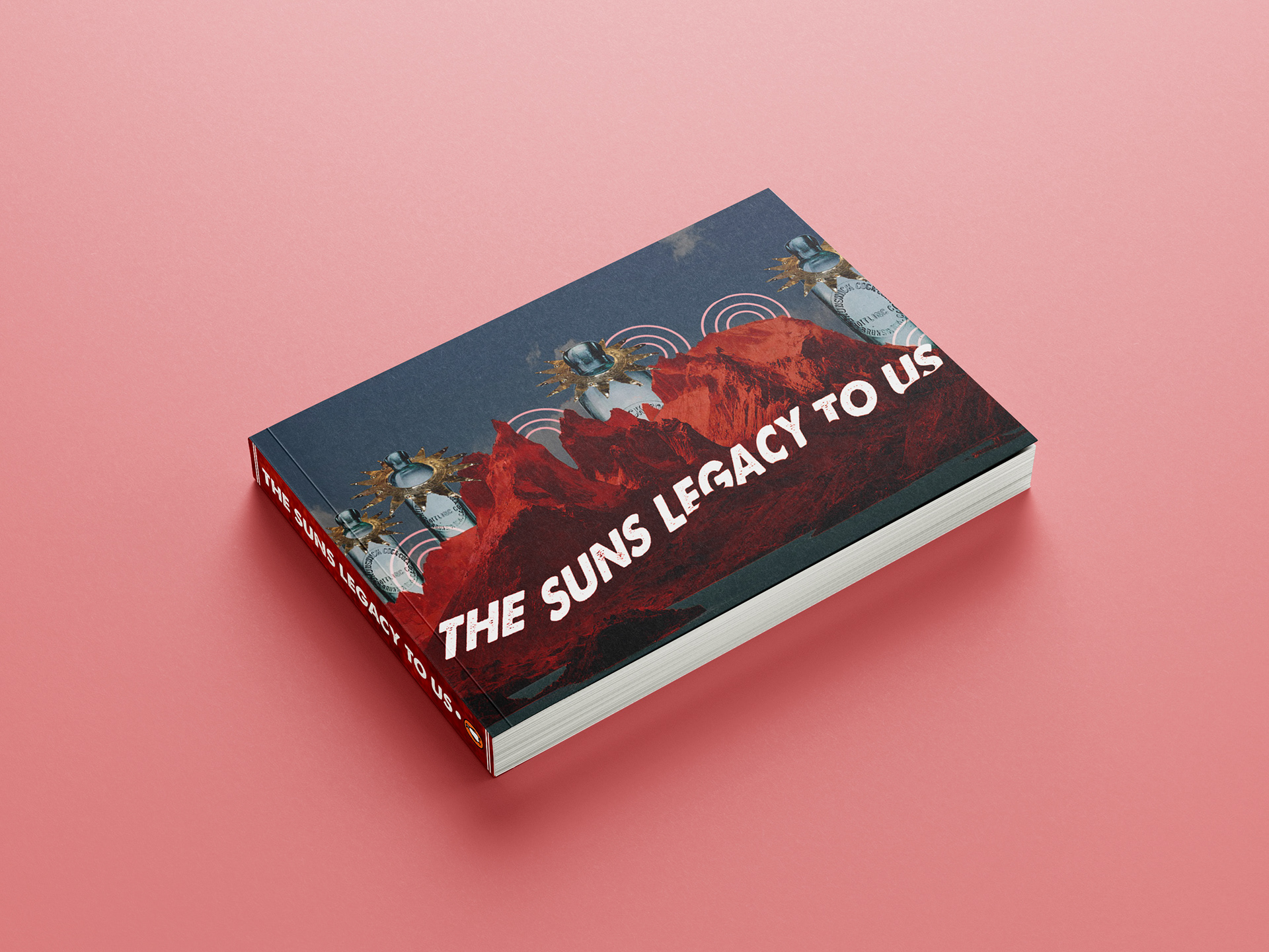
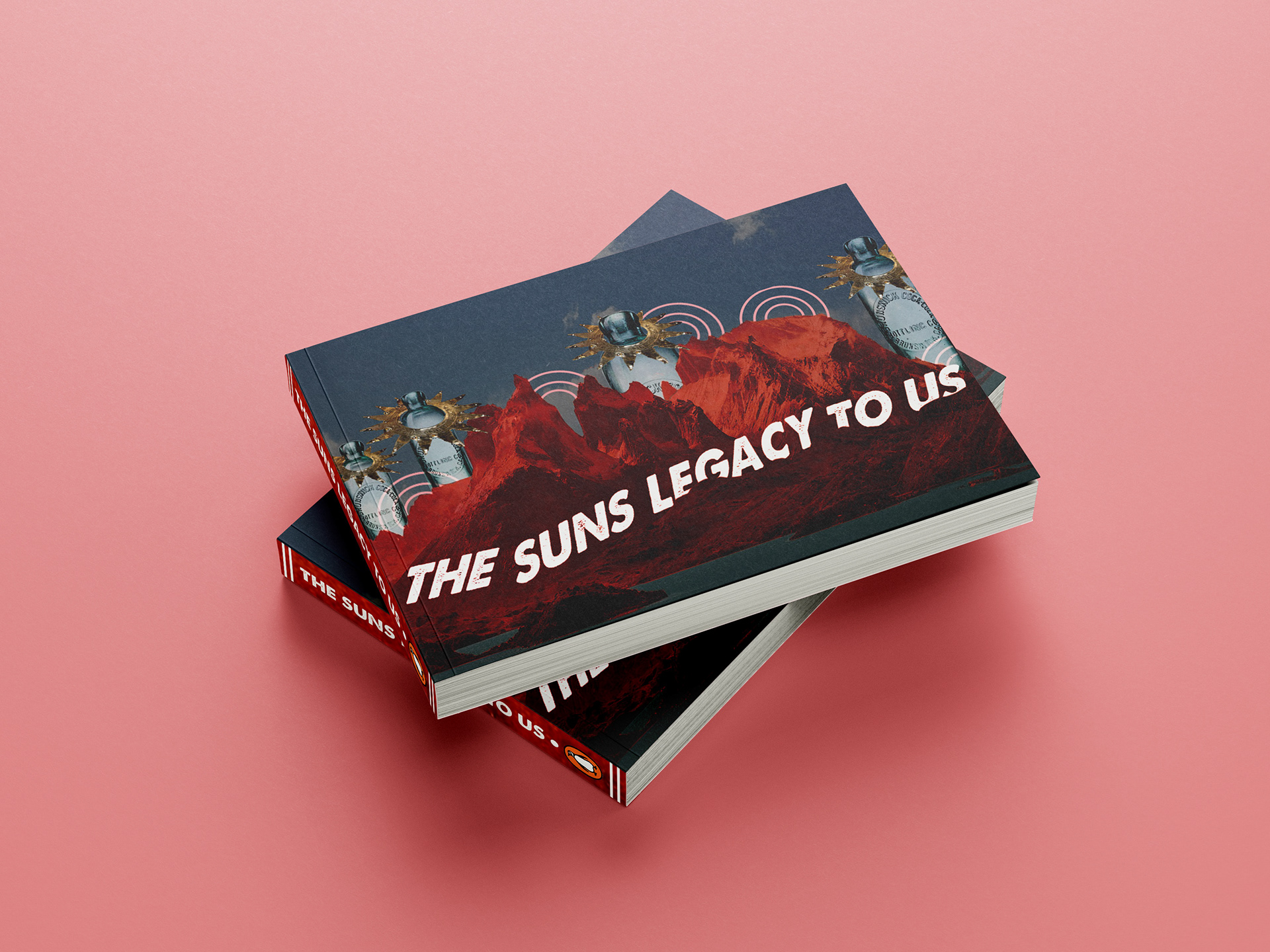
I chose to create book covers out of the images, so came up with my own title and found a text family which I felt complimented the rest of the images (A Love Of Thunder). Once I had the covers designed and mocked up, I then made them into books.
MADDER BROWN BOOK
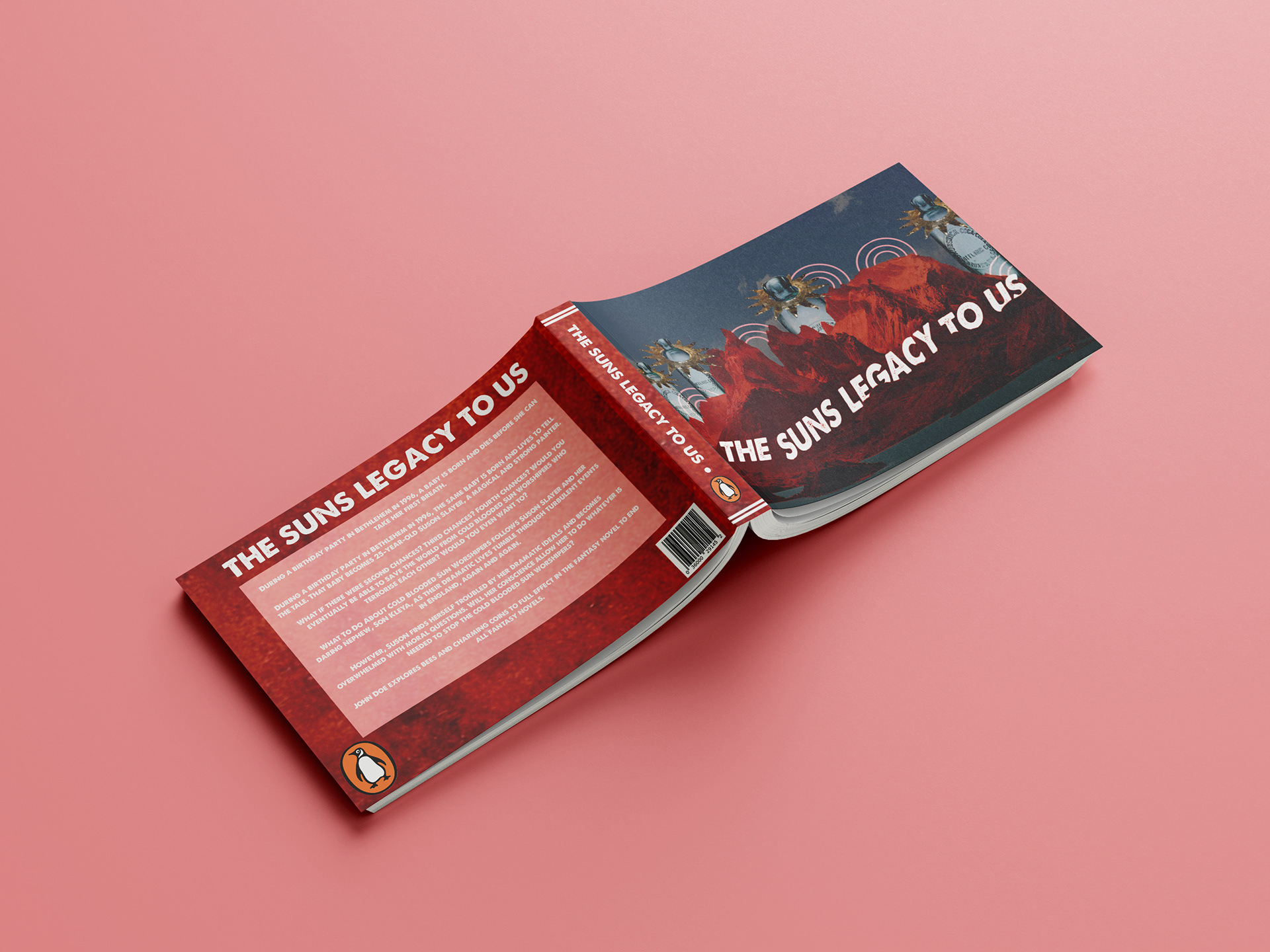
Bethlehem BOOK

